For Cars.com, I helped steer a transition from using Invision, Sketch, and Zeplin apps and services to primarily Figma for our Product Design team.
Throughout my roles as Senior Product Designer and Senior Manager of Product Design at Cars.com, I led efforts to transition away from our 3 main tools in our workflow: Sketch for crafting designs and representing our design system UI-kit, Invision for prototyping, and Zeplin for sharing and collaboration. We aimed to replace them with one application that could accomplish all of these to our needs: Figma.
Components and styles library
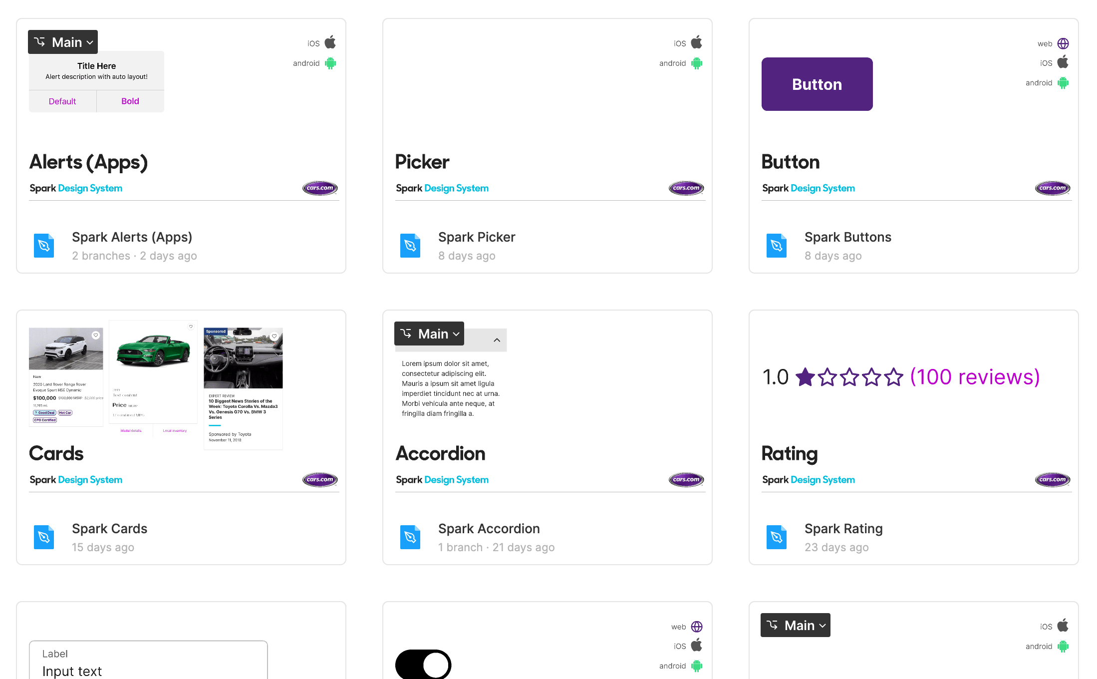
The first step in transitioning to Figma was to recreate, and enhance along the way, our component and shared styles libraries.
Including new features such as component variants, interactive components, and auto layout, these components were created with the following criteria:
- Easy to use
- Easy to maintain
- Comprehensive
- Fully WCAG 2.0 compliant (and beyond)
- Matches or enhances currently utilized patterns and conventions
- Utilizes new shared styles
- Resistant to regressions
Shared style names for colors and fonts matched design token naming that is utilized in our engineering implementations, thus offering developer inspections true token/variable name reference.
Annotating specifications
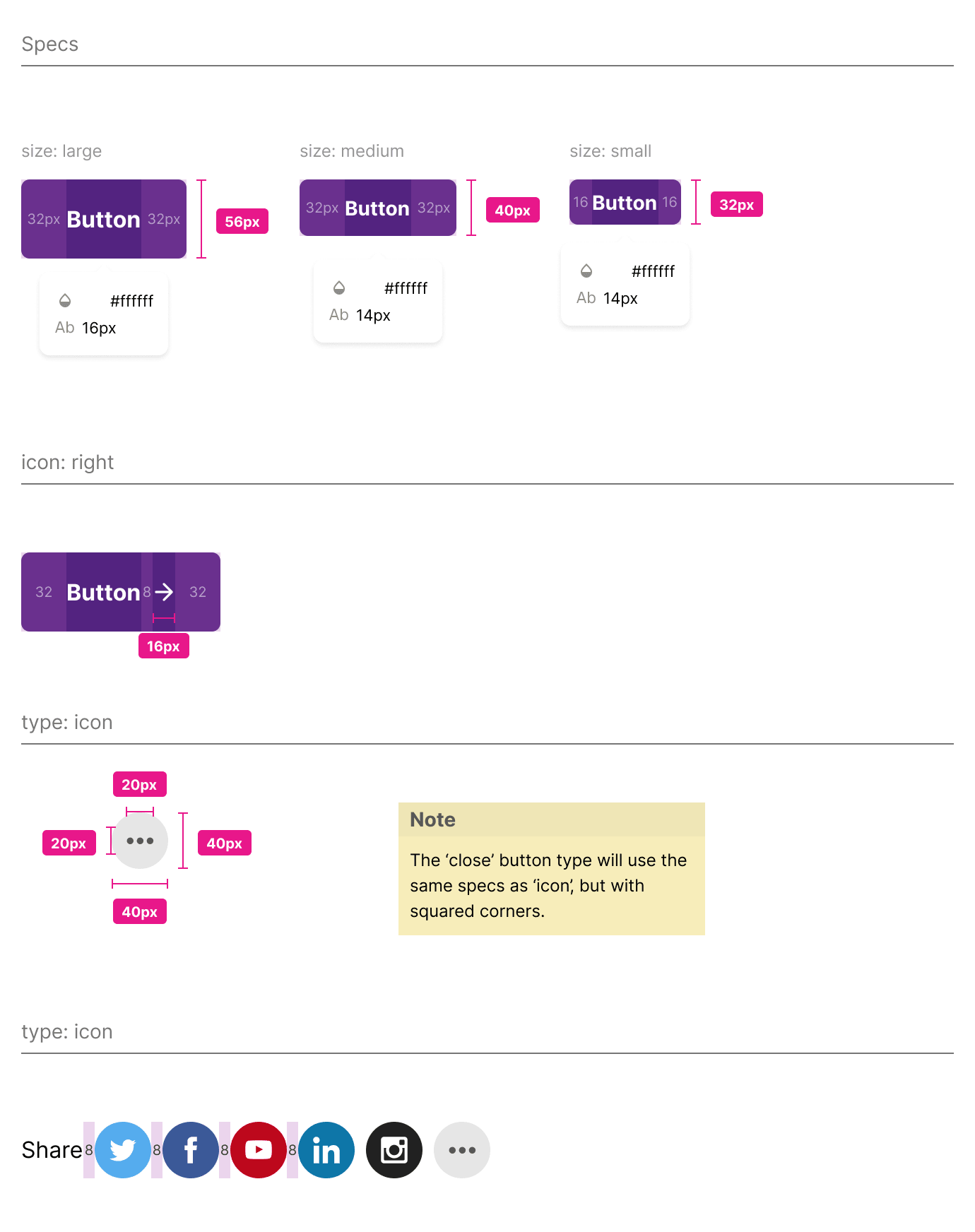
Components were also annotated in a separate view to help with reference and documentation purposes. In many cases, plug-ins such as Figma Measure were utilized to standardize and apply measurements. I created custom components for vertical and horizontal spacing to denote values along our system of 4s and 8s.
These views are also shared into Storybook, for our developers to implement against and compare to, ensuring alignment on padding, margins, colors, etc (at least until, and if, Figma allows for tokenizing spacing values in auto layout, which will change the game quite a bit).
These views were requested from both designers and developers, as a quick reference for specifications, and also a faster method for reinforcing or remembering specs when iterating on, updating, or just using existing components. This also helps demonstrate and reinforce the shape system used in the design system’s visual language.
Organizing Figma
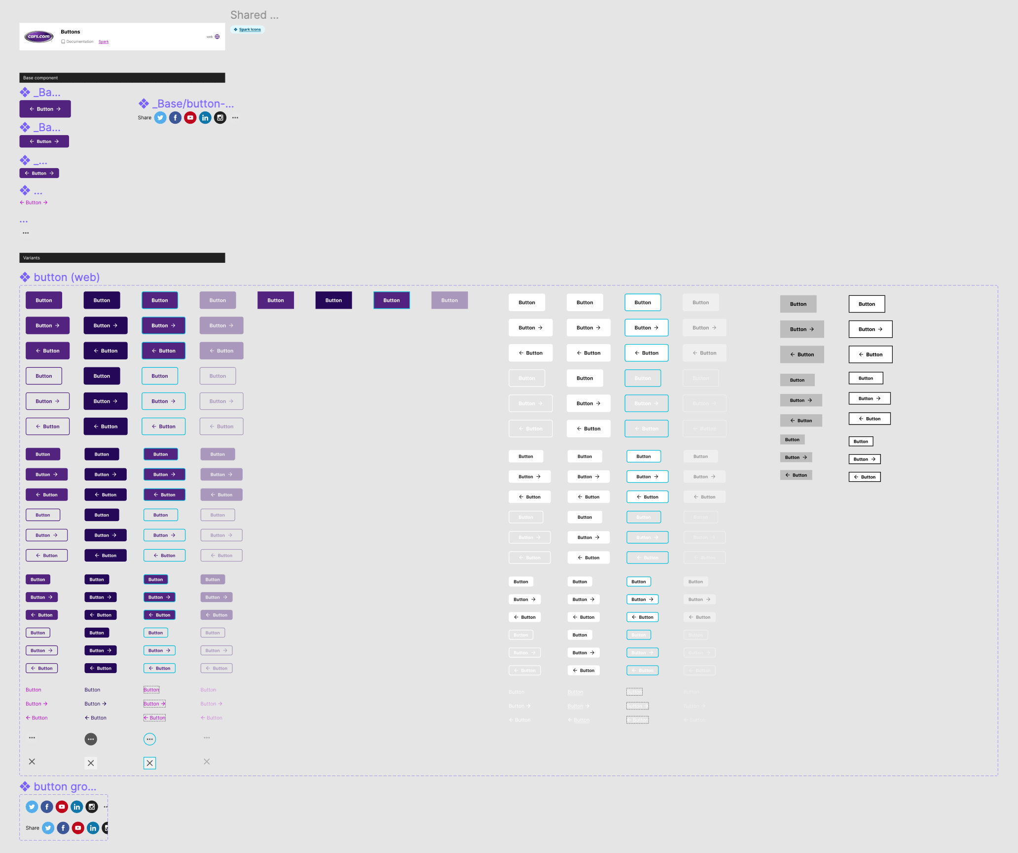
After researching Figma component library organization techniques, we opted to put each component in its own Figma file, something I had not seen done often. The Credit Karma design system team talked a bit about the pros and cons of this approach, and they swayed us along with Figma’s updated version history features.
This approach allowed for the following per component:
- Own version history - Figma’s version history is powerful, and this allowed versioning and reverting individual components without affecting the entire library.
- Branching and permissions - Branches and editing permissions could be lent out at the component level, protecting the rest of the library.
- More room for exploration/iteration - Pages within files could be used for exploration, and even multi-platform components. This library uses one file for web, iOS, and Android versions of each component.
Onboarding the team
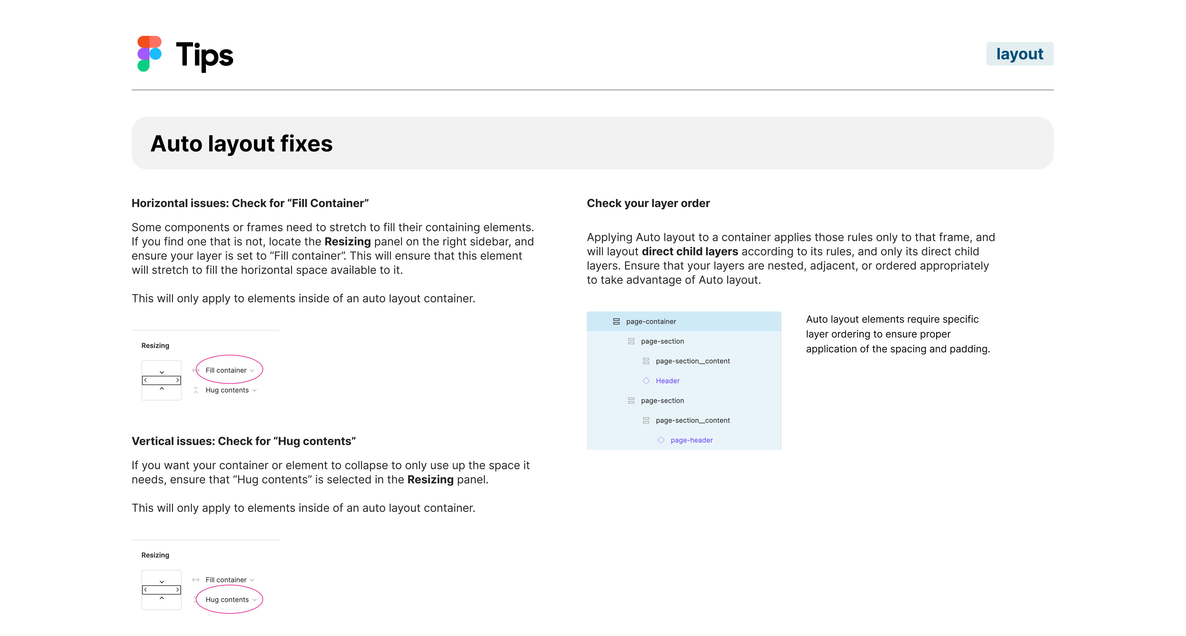
Onboarding our team of experienced Sketch, Zeplin, and Invision users took a bit of time, especially since we were in the middle of a major website redesign and replatforming project. Our team of Product Designers only had a measured amount of time to devote to learn a new tool, acclimate themselves to a newly structured library of components, and recreate experiences.
I created some Figma files with tips and tricks I discovered while setting things up, and that I had learned while diving into creating pages and prototypes. Putting these together in a “Getting started” handbook helped to explain some of the more nuanced features of Figma, and also how we may apply those features to how we work at Cars.com.