A sample of ongoing component and pattern work in Pando: a card refresh, responsive tabs shaped by user research, a new pagination component, modal iterations, and a badge redesign that came out of the Pluralsight rebrand.
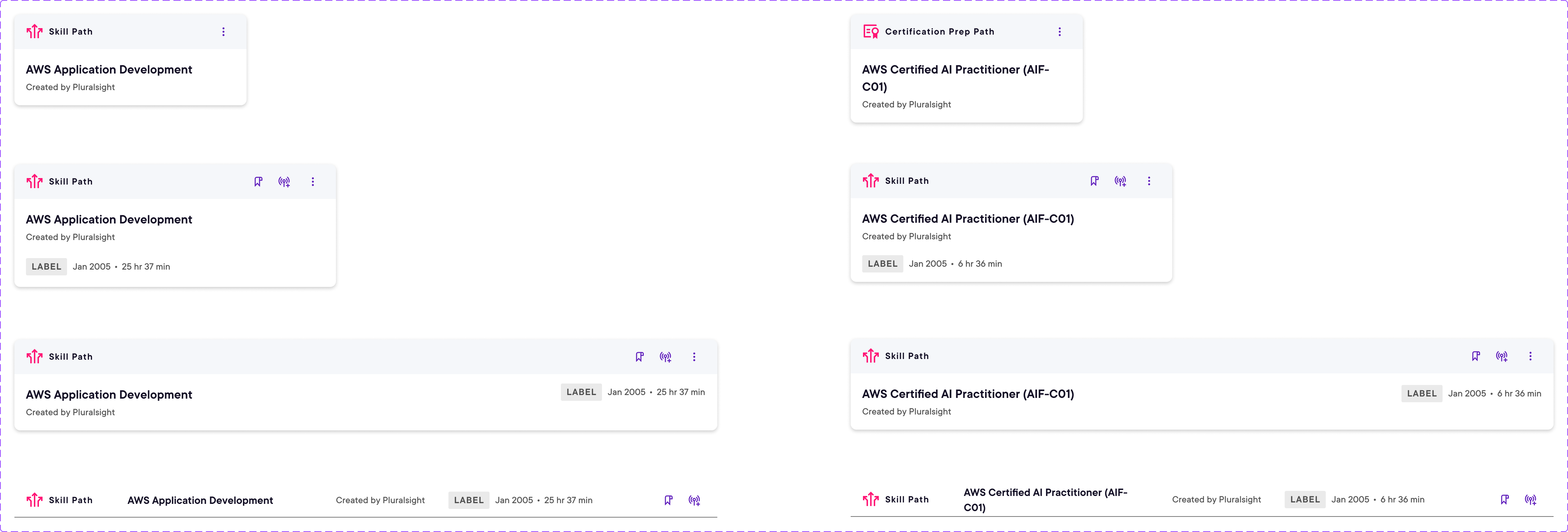
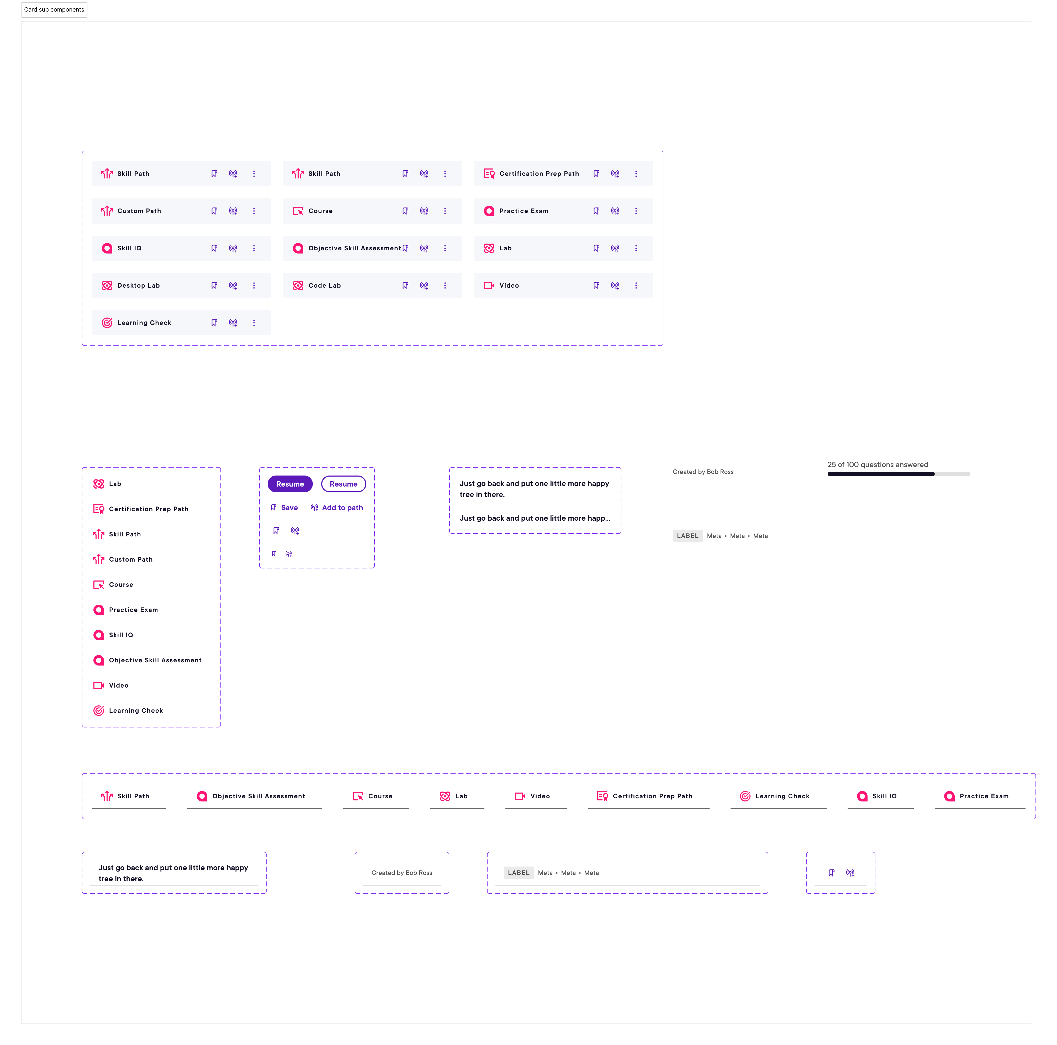
The card system got a structural refresh. The main work was defining a clearer layout grid and breaking the component into composable sub-components, so designers could assemble cards from the same set of pieces rather than maintaining separate variants for every use case. The sub-component model makes it easier to extend without creating one-off components every time the content changes.
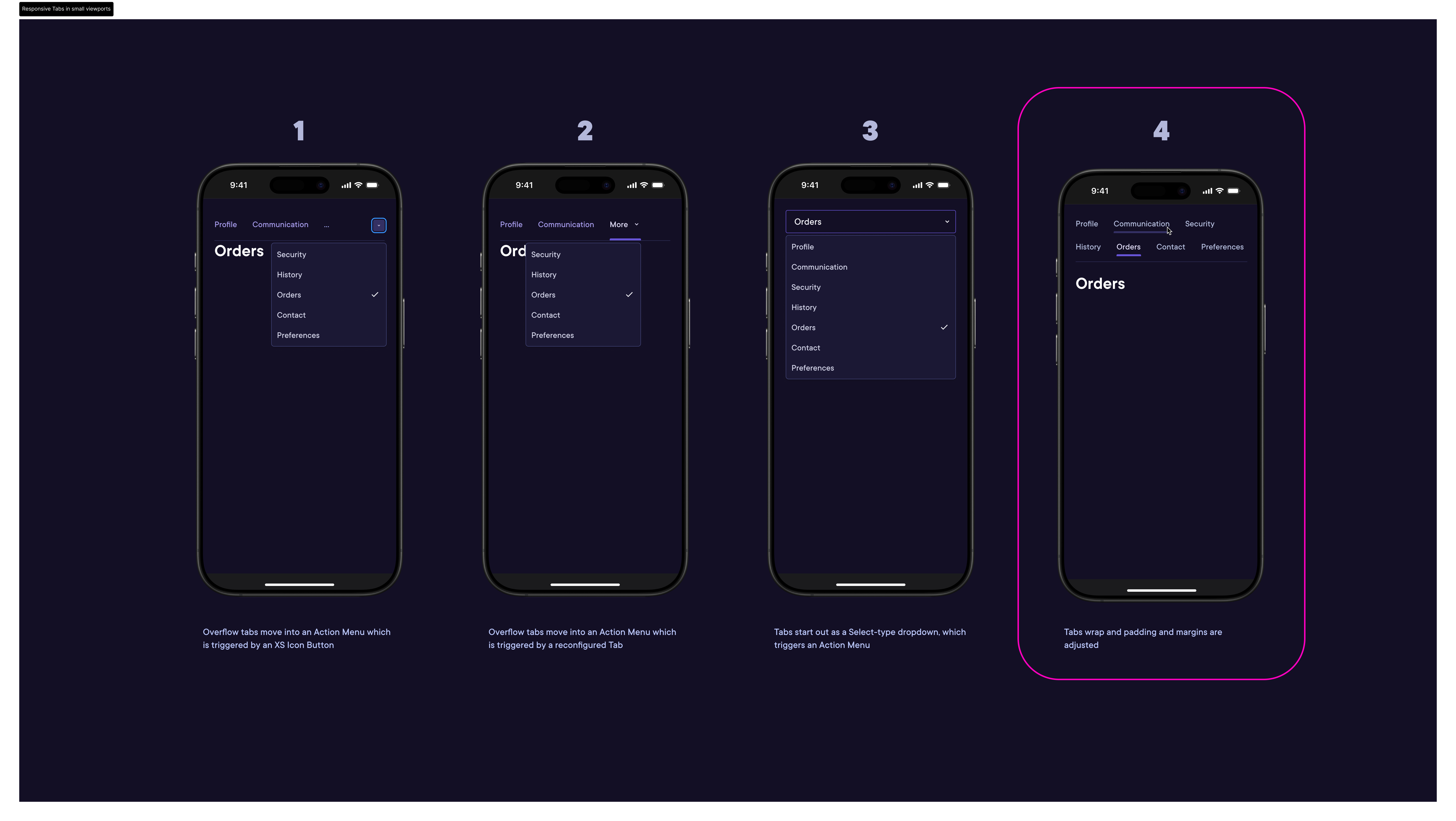
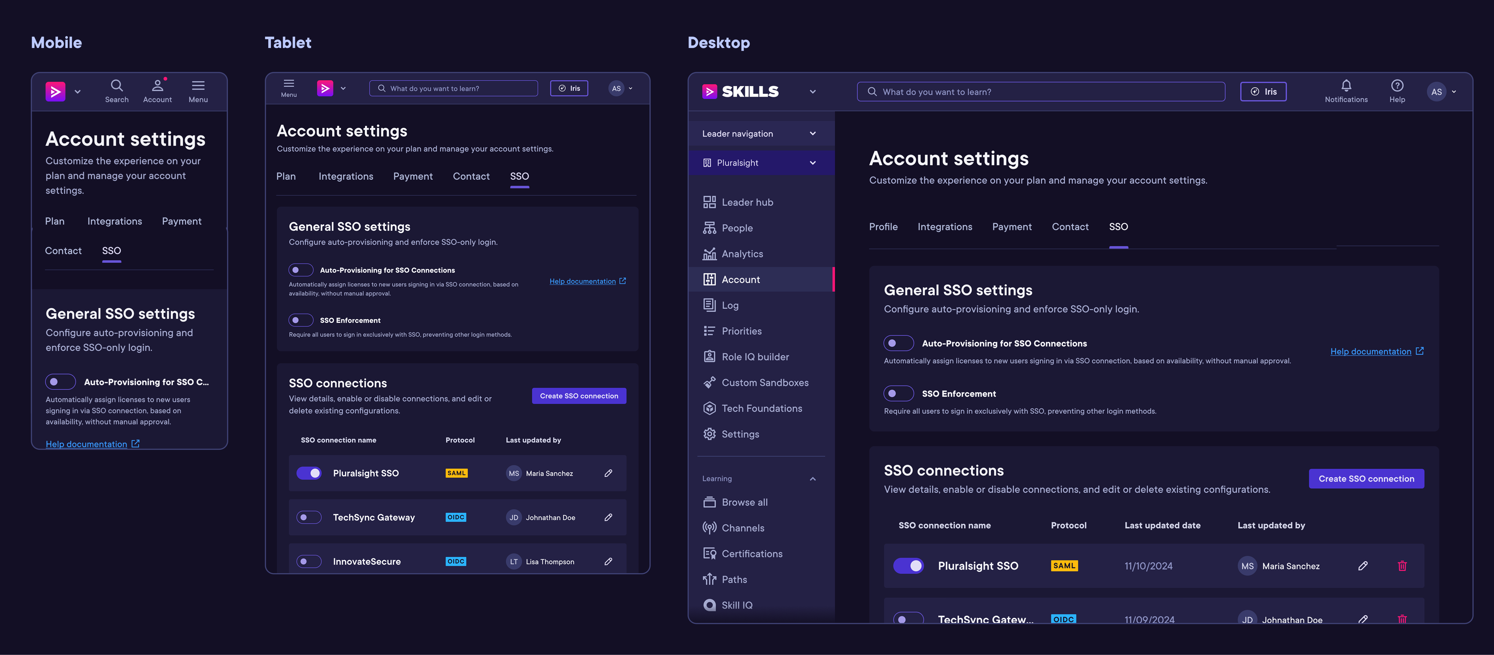
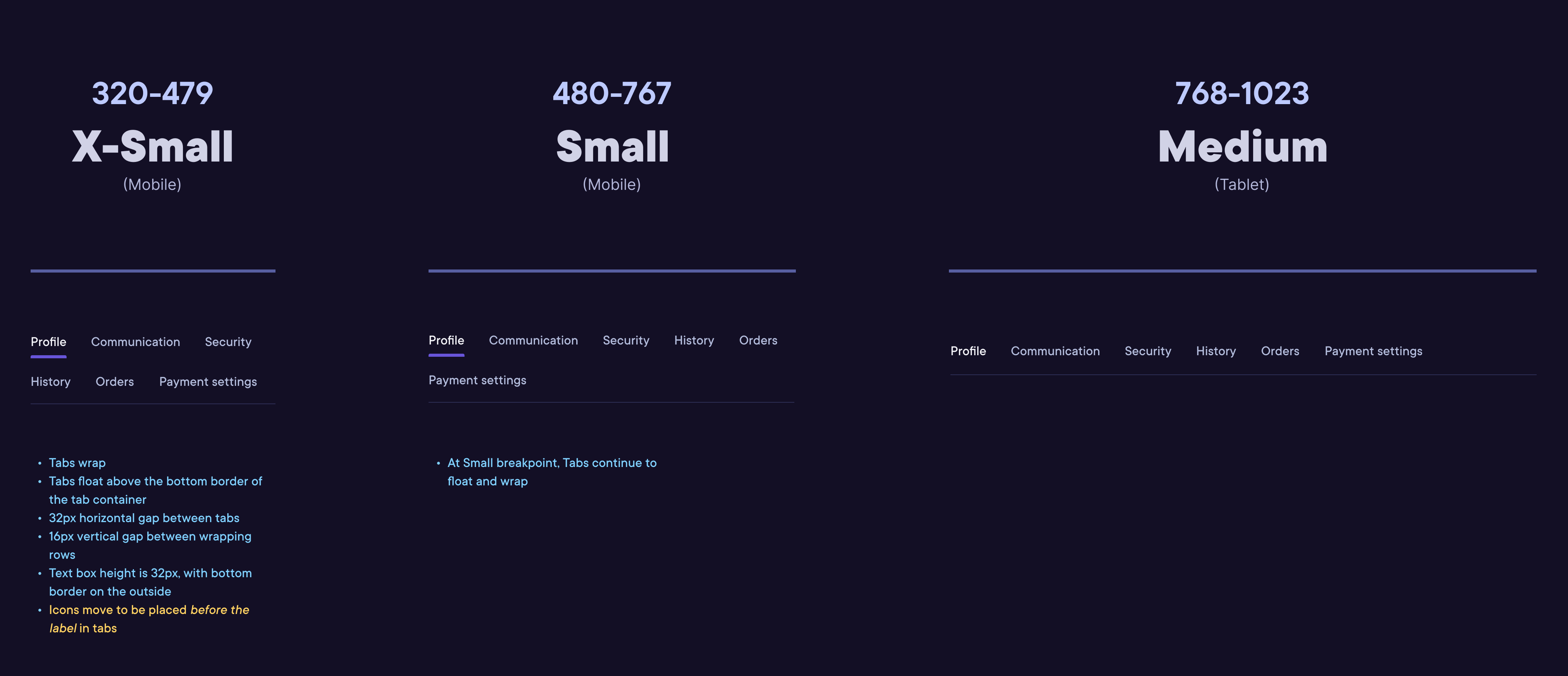
The responsive behavior for tabs took real deliberation. A dropdown at smaller viewports was the easy path, but it meant extra code, extra design work, and a pattern swap that would change user expectations between screen sizes. We went with a wrapping approach instead, shifting tabs into a floating button-style layout at small viewports while keeping the original look and feel. Testing confirmed users understood it and could get to the content without any trouble.
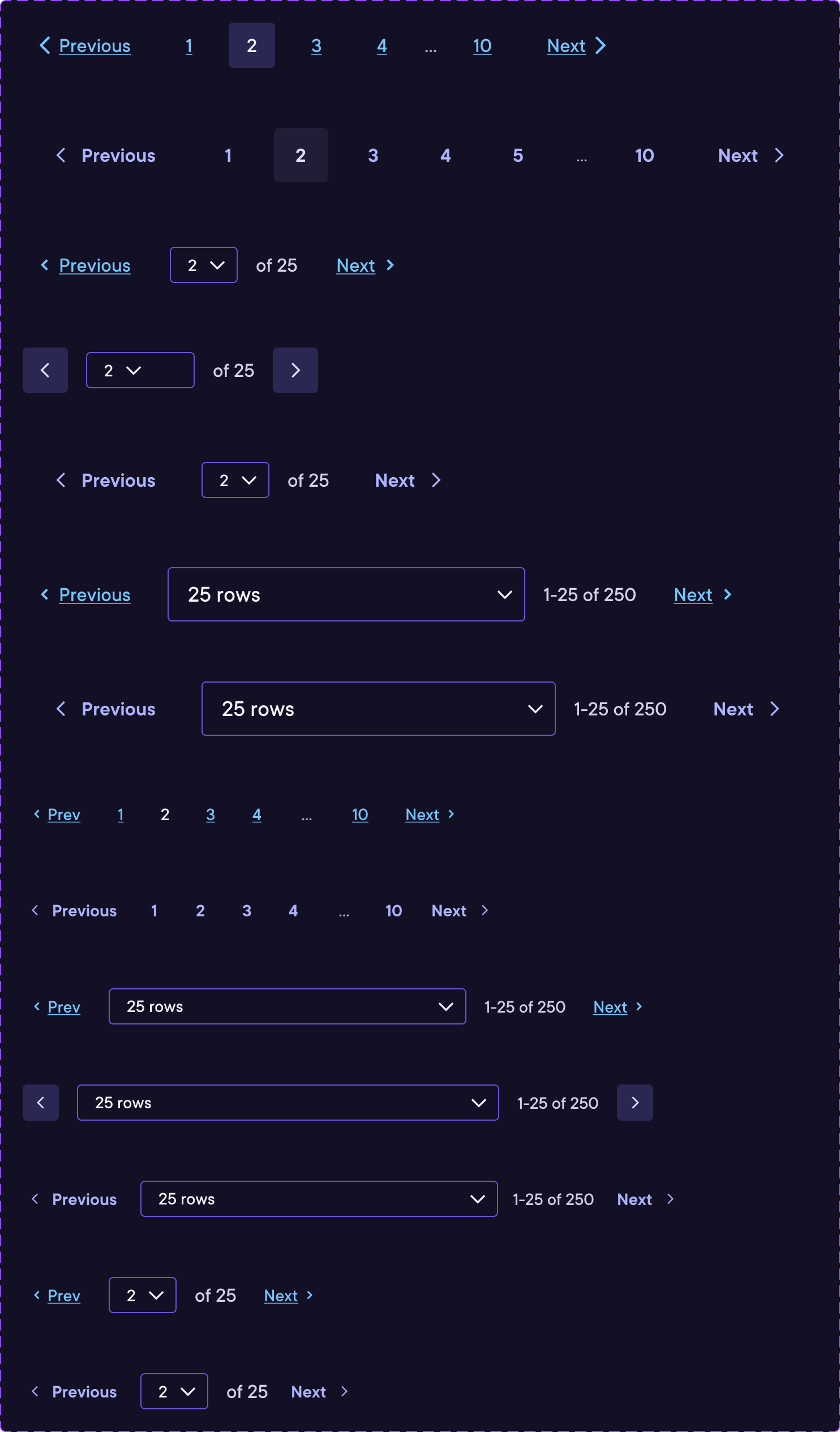
Pagination was a new component. I built it out with the full range of variants it needs to handle: first page, last page, the middle range, truncated sets. Getting all the states covered up front saves the back-and-forth that happens when edge cases surface during implementation.
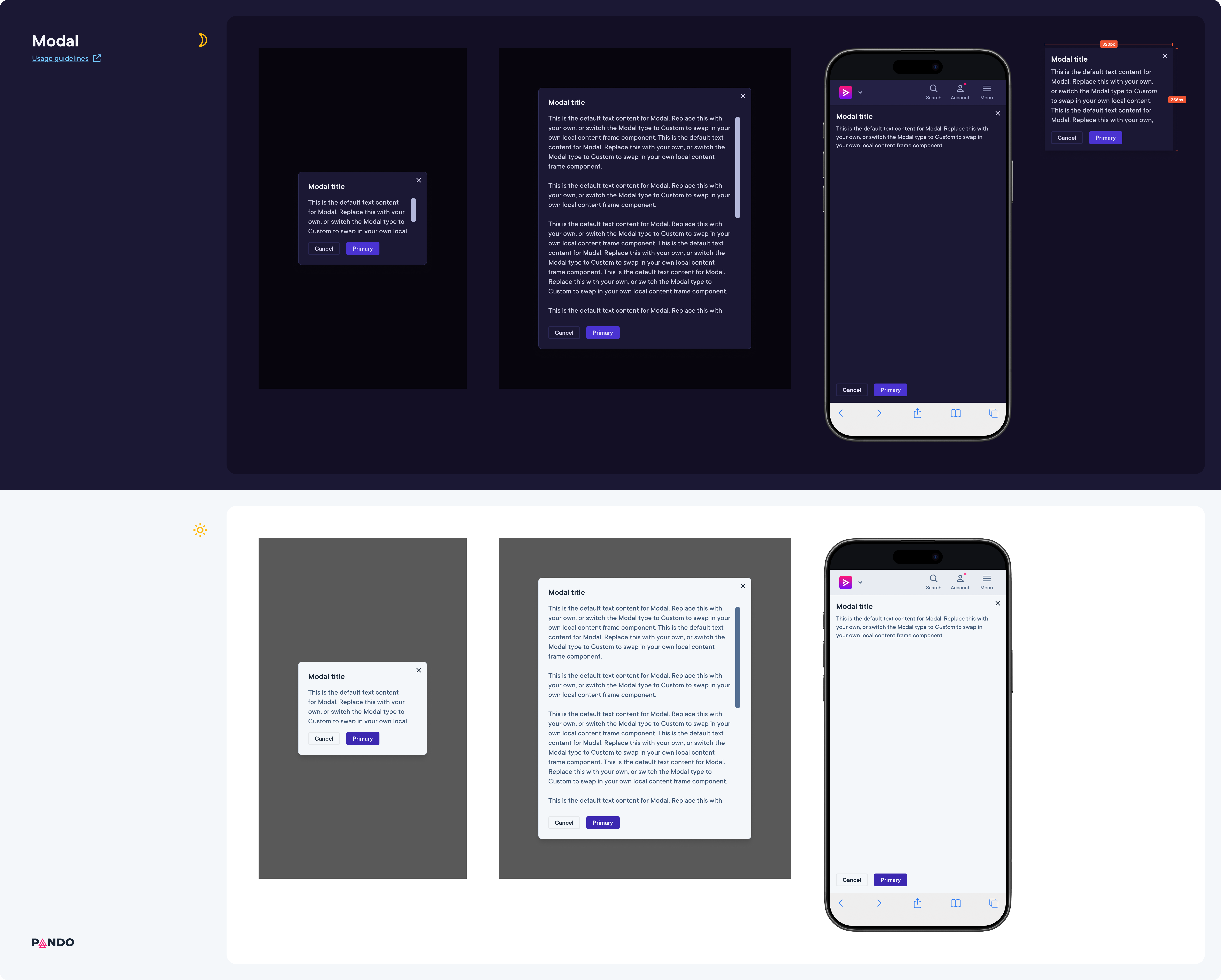
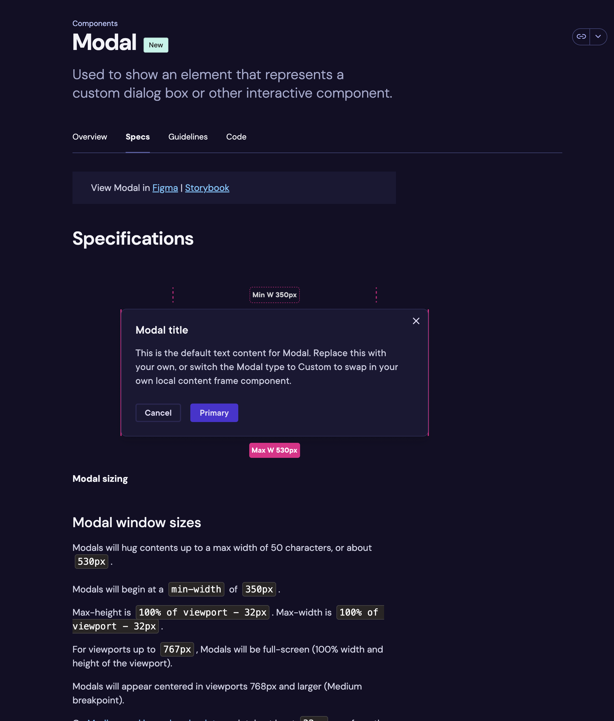
The modal got several rounds of iteration in the UI-kit, covering internal structure, content configurations, and how it documents in Zeroheight. The Zeroheight specs page for the modal ended up being one of the more thorough component documentation pages in the system.
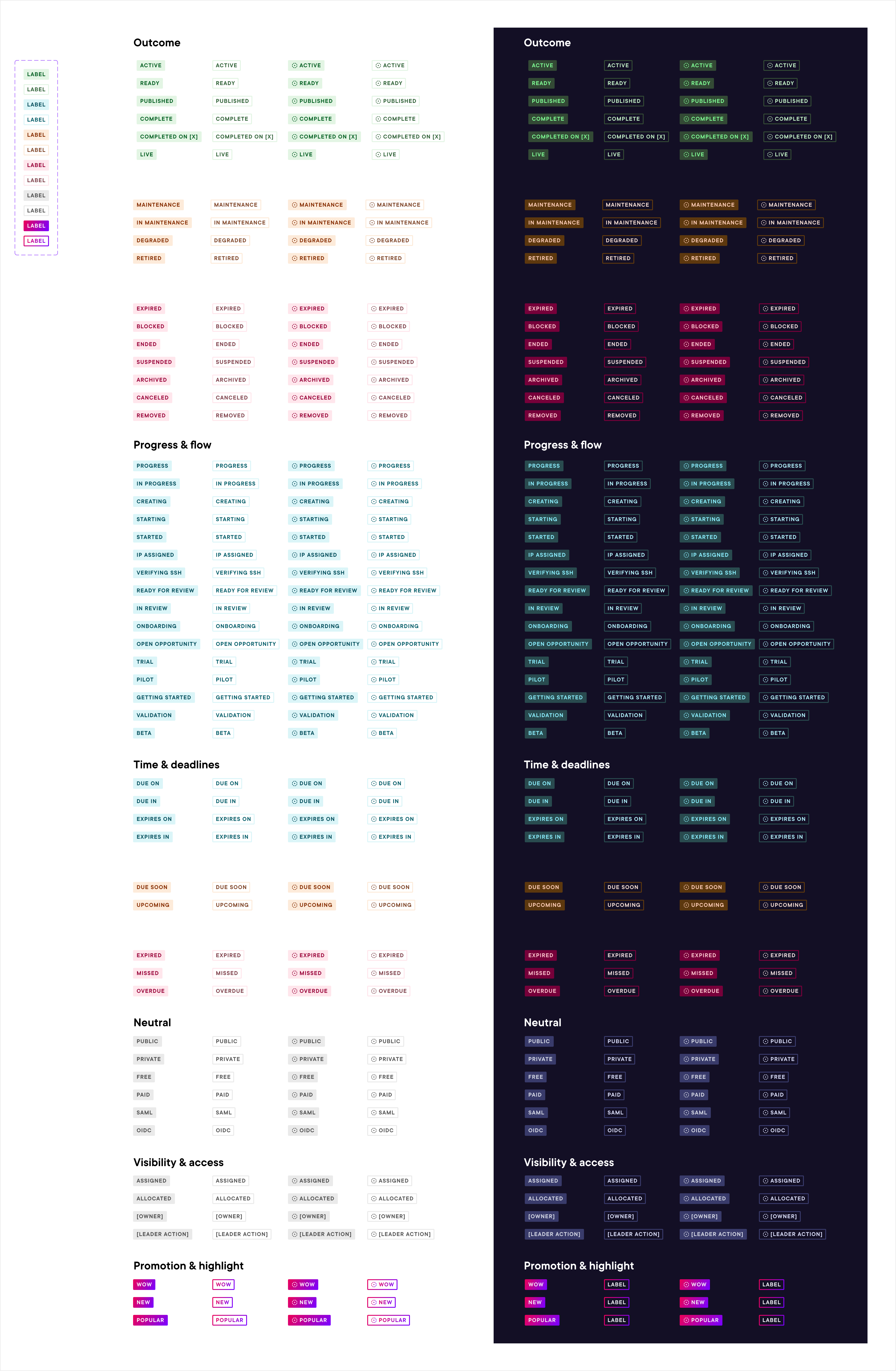
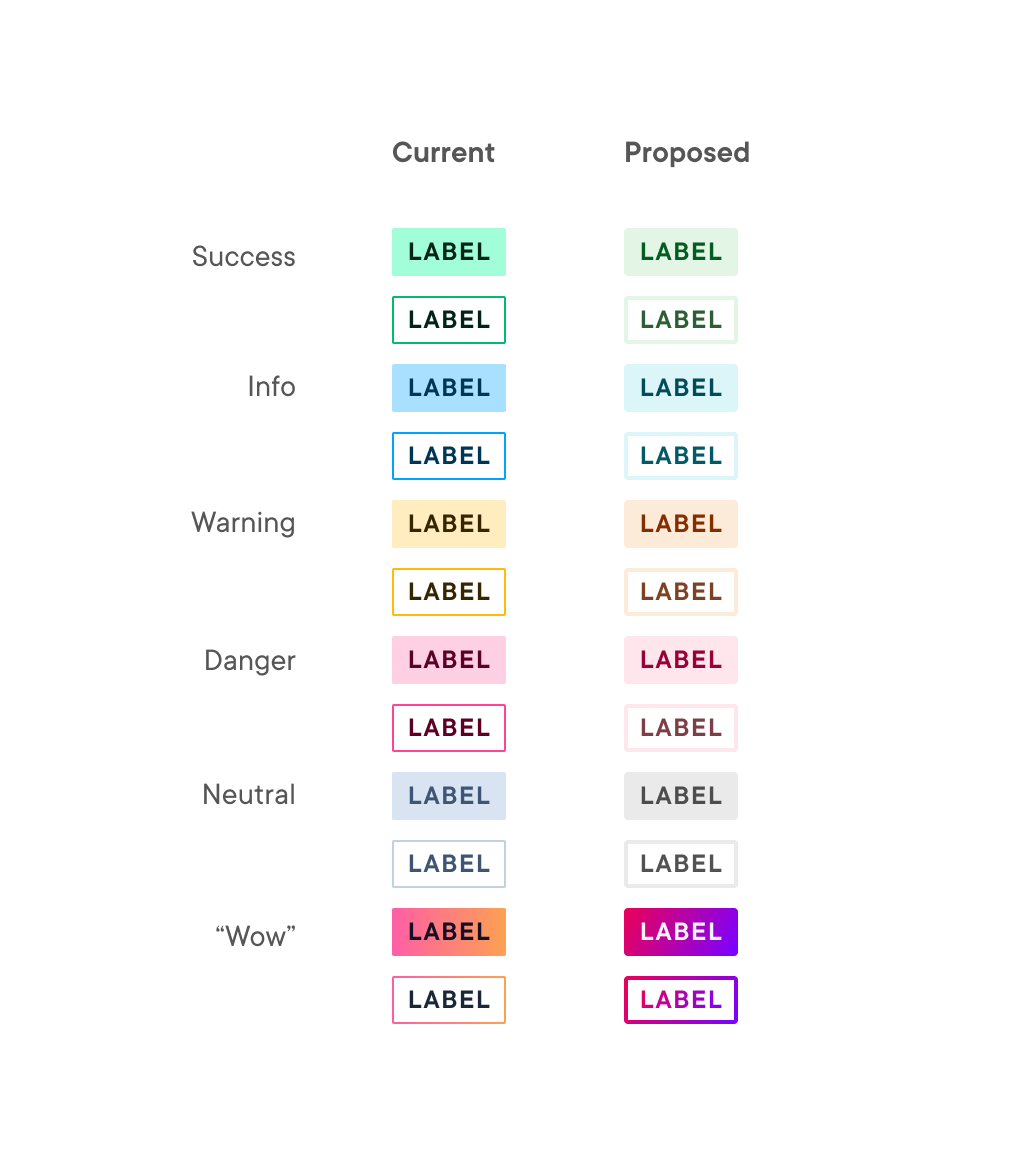
The badge pattern needed a rethink when Pluralsight released its rebrand in summer 2025. The old badges used colors that sat too close to the system’s status palette, which created ambiguity about what a badge actually meant. The redesign introduced a clearer classification system and a simplified color set that passes WCAG AA without borrowing from the status colors.
Each of these took longer to get right than it looks, which is usually the most useful thing to know about component design.