Pando is Pluralsight’s design system. As its Principal Product Designer, I built the component library, drove adoption, and kept the decisions grounded in accessibility. The goal was making Pando the thing designers reach for without thinking about it.
The problem
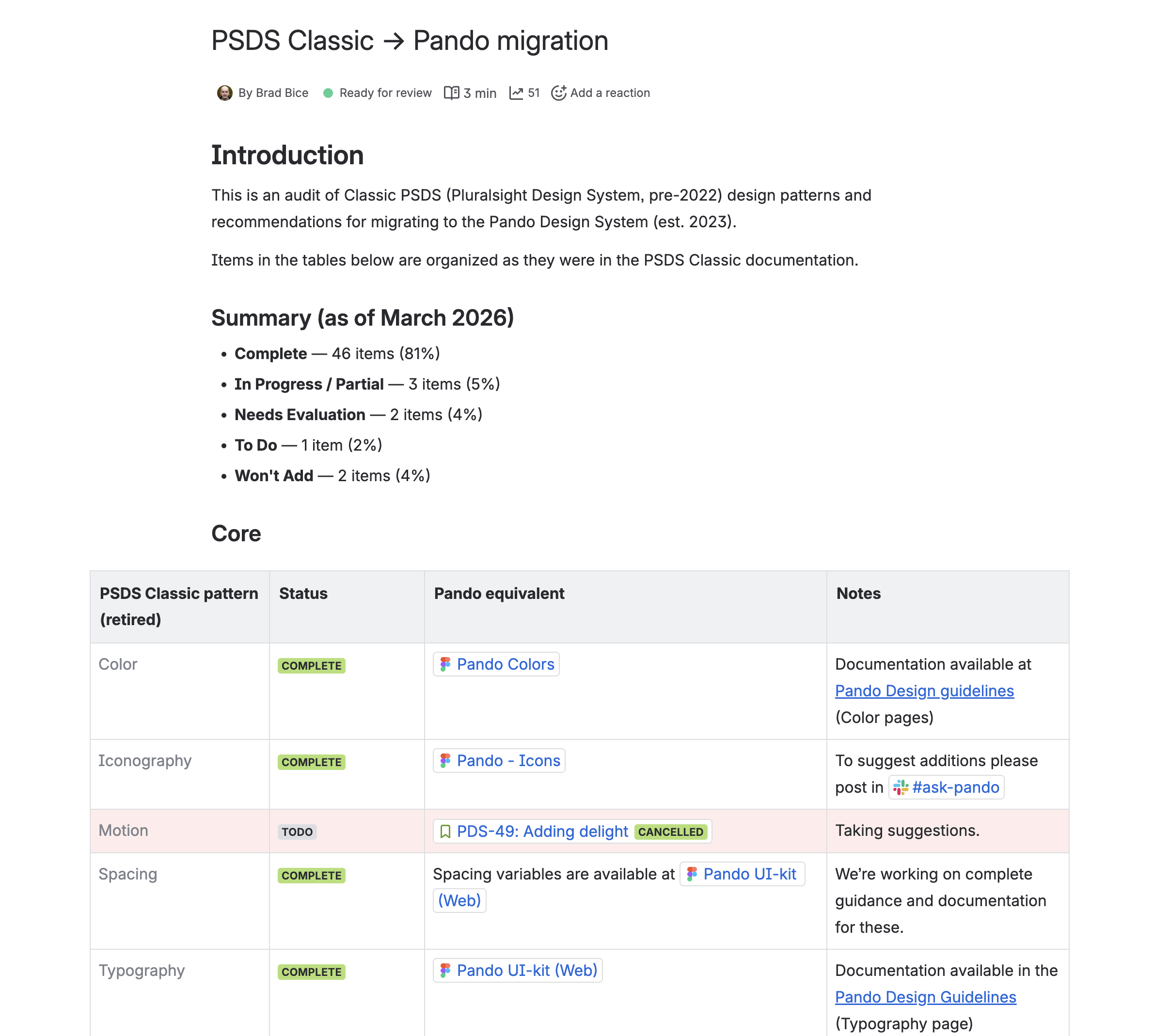
Design and engineering at Pluralsight had inconsistencies all over the platform, and they had been there a long time. Teams kept trying to fix them one at a time, but there was never enough dev time to finish the job. On the design side, when a designer needed a component or a variable that wasn’t in the kit, they would just detach it or build their own. Reasonable in the moment, but it quietly chips away at the point of a design system, and it slows everything down later when it is time to build.
The real problem wasn’t a shortage of components. It was trust. Designers needed a system complete enough to reach for by default, and a team responsive enough that the gaps got closed instead of worked around.
What I did
Most of the work was the component library itself. I expanded variant coverage and wrote the documentation so designers could drag in a pre-built component, with selected and unselected states already handled, instead of starting from scratch every time. Along the way, I updated the kit to use Figma’s auto layout and variables throughout, which made components more contemporary, easier to theme, and structurally closer to the CSS and React code engineers were writing.
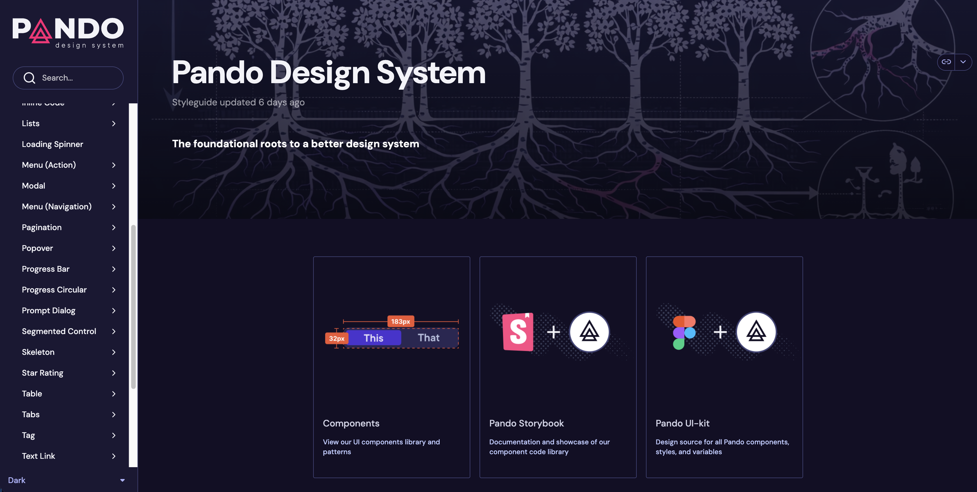
Adoption came from responsiveness more than anything else. I kept a tight feedback loop with the design org, and when something was missing we either added it or explained the accessibility reasoning for why it wasn’t there. Over time that built trust in the decisions behind the system, not only in the components themselves.
I also spent real time teaching the system instead of just handing it over. I ran a multi-week Figma learning series for designers, with real examples and live demos in every session, plus prep work on Figma Make and Claude Design. And I built a documented, reusable Claude skill for Pando, a structured and repeatable way to generate on-system UI and documentation by default.
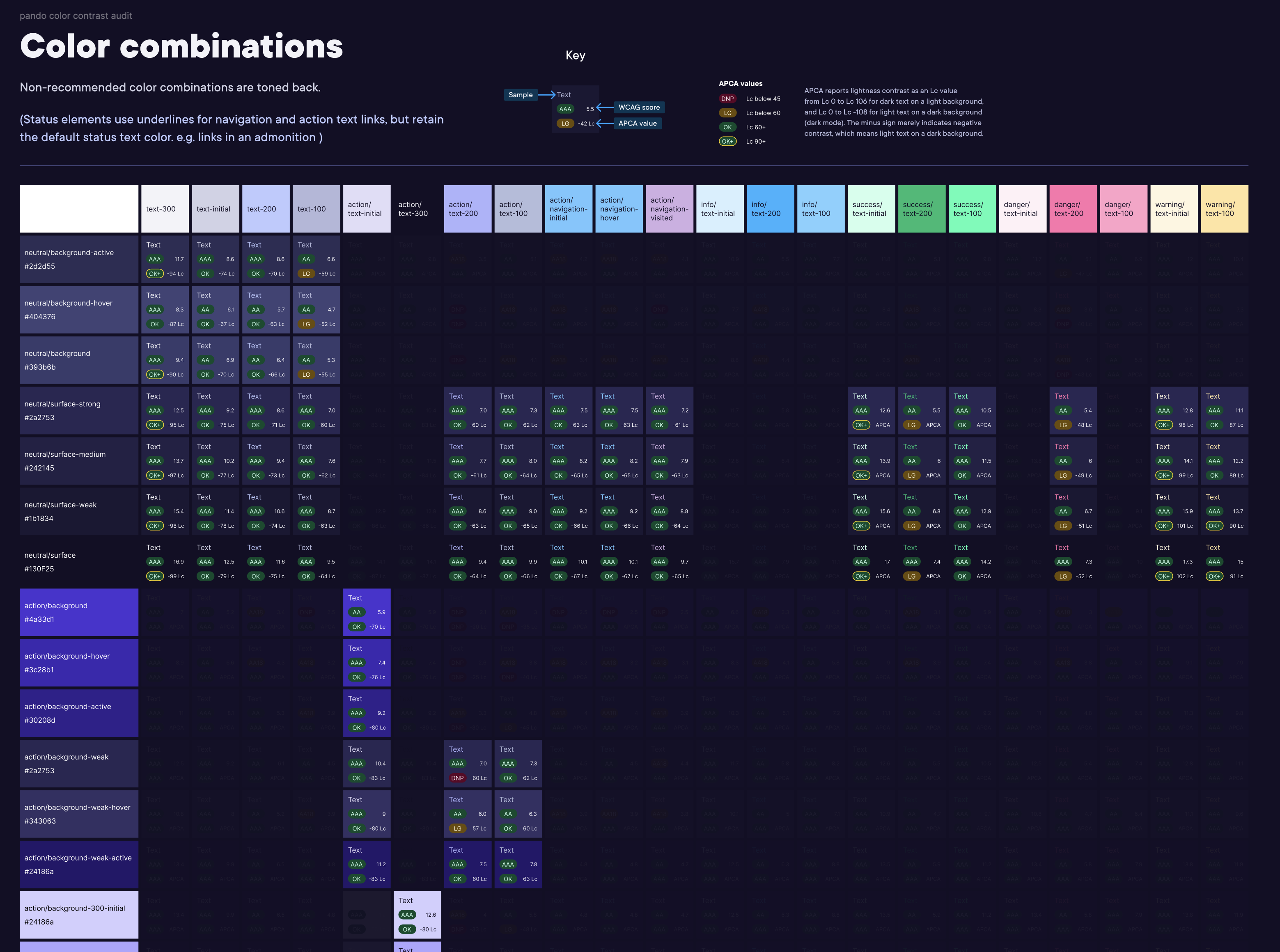
A lot of the component decisions came straight out of accessibility research. One that stuck with me was making sure toggle states don’t rely on color or position alone to tell you whether something is on or off. That exact issue came up independently in a usability test later, which was a good sign we had been looking in the right place. I also ran an APCA color contrast audit across the system, identifying which color combinations were safe and updating the ones that were encouraged but not quite meeting the bar.
What came of it
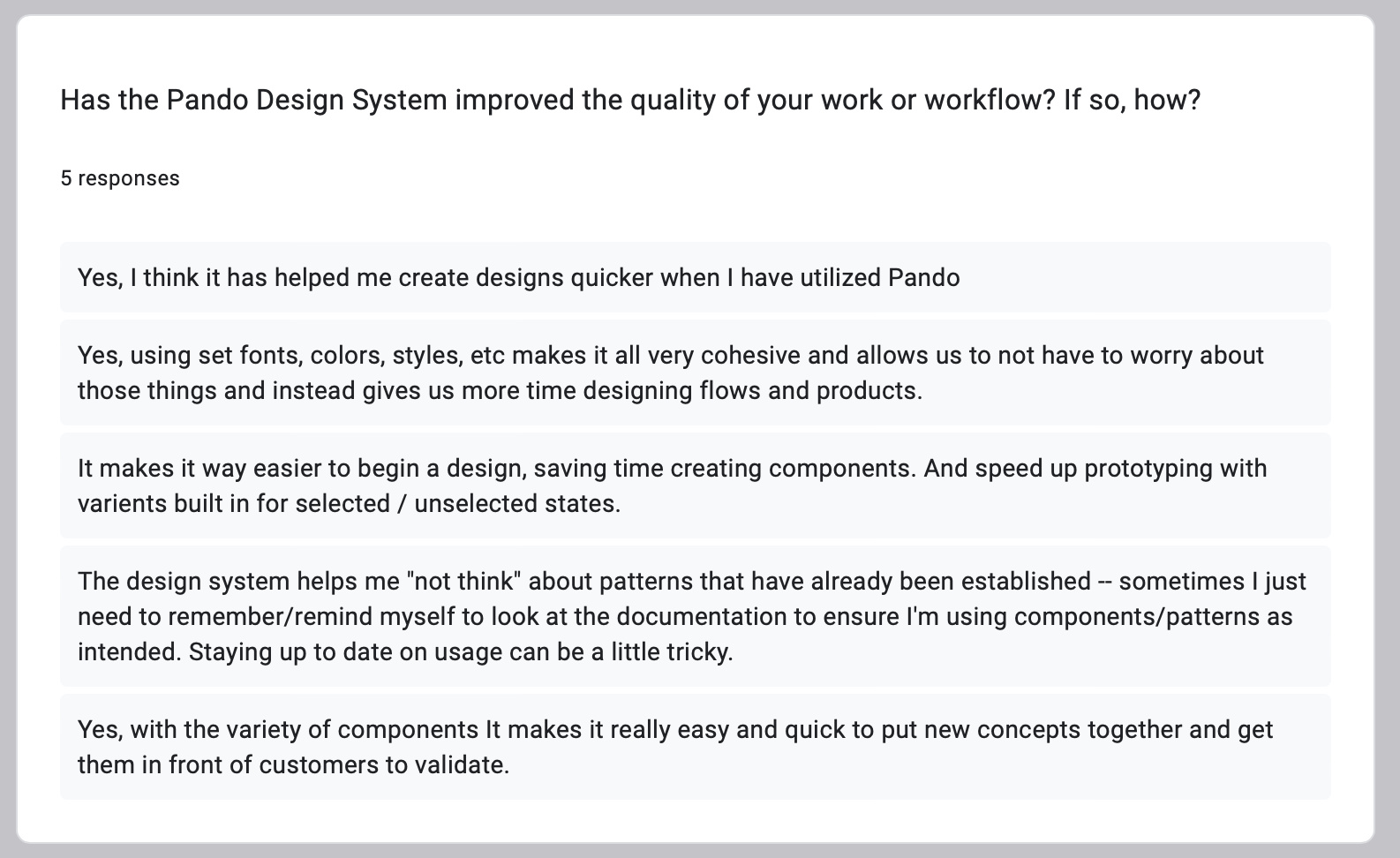
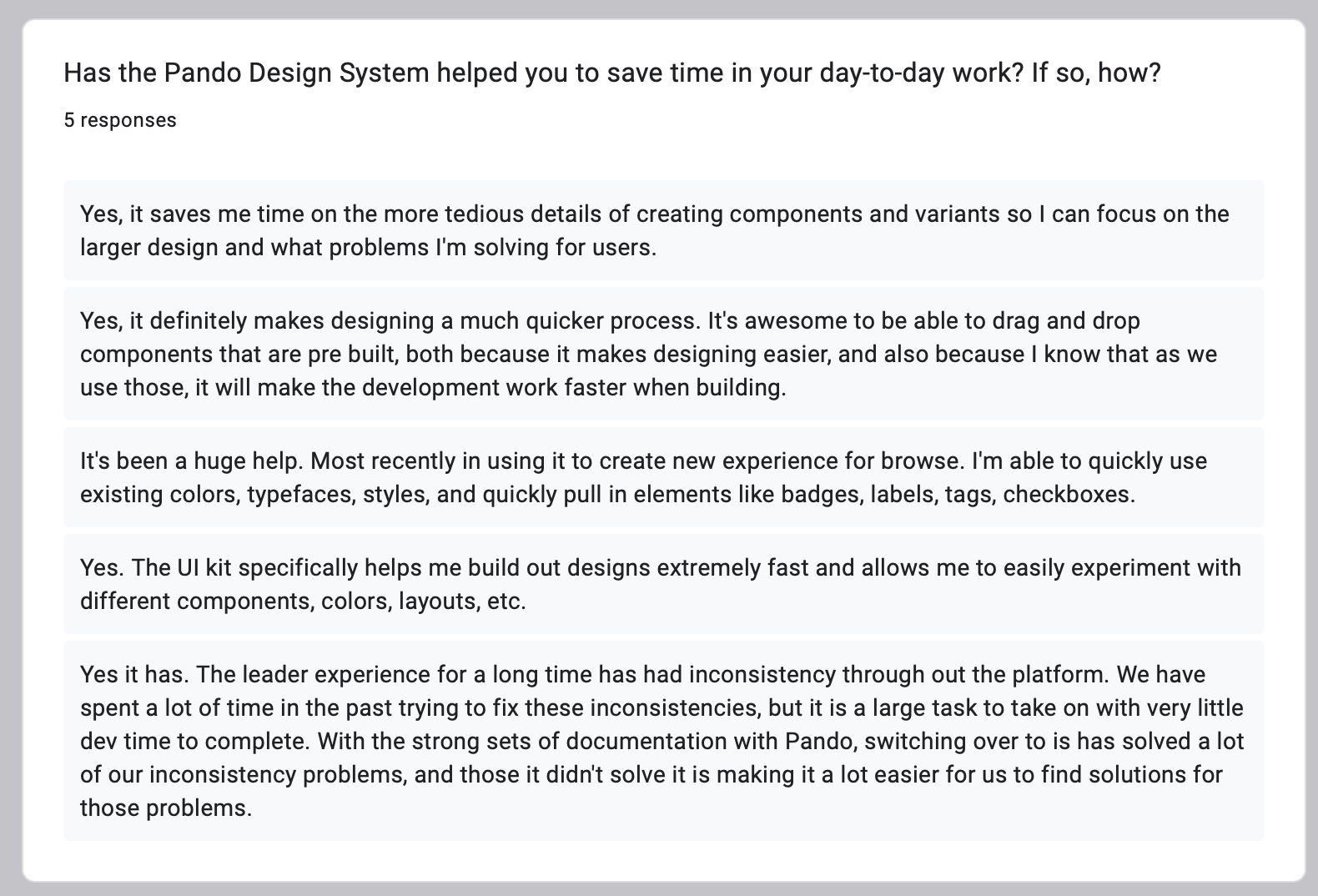
I sent a short survey to designers using Pando. Five responses per question, and the pattern was consistent.
Every designer who responded said Pando improved the quality of their work. They pointed to faster design work, the cohesion that comes from shared fonts, colors, and styles, easier prototyping with states already built in, and getting concepts in front of customers more quickly. Every one of them also said it saved time day to day, less of it spent on the tedious component-building and drag-and-drop that is already done, and (the part I like) work that is faster to build later because it was made on-system from the start. The general read was positive, with people calling out variant coverage, ease of use, the real effect on how they design, and the fact that the team stayed open to feedback.
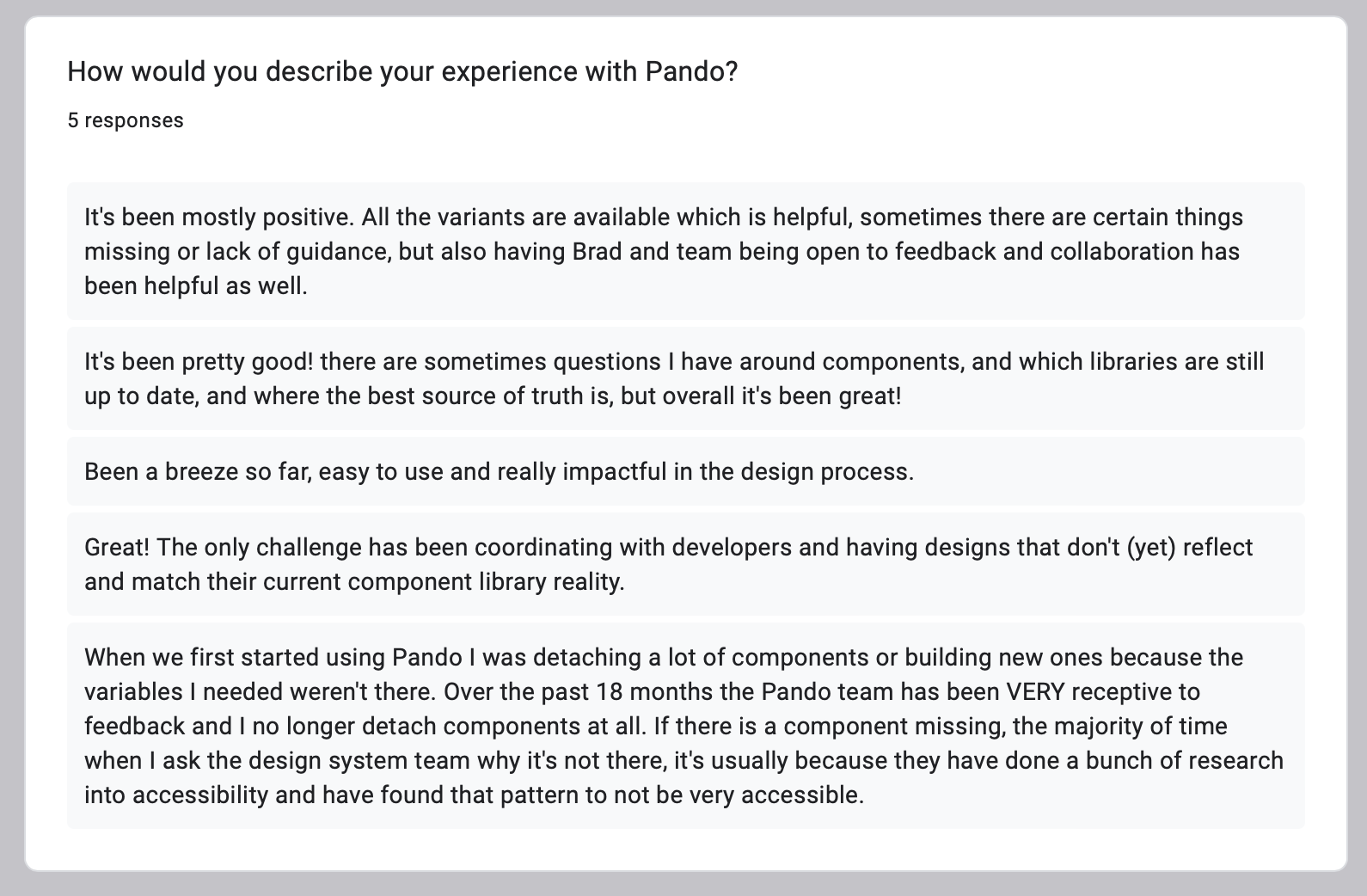
The result that means the most to me isn’t in the survey numbers. One designer described an 18-month arc: early on they were constantly detaching or rebuilding components because the variables they needed weren’t there, and by the end they had stopped detaching components entirely. When something is missing now, it is usually because we deliberately decided the pattern wasn’t accessible. That is the whole thing working the way it is supposed to.
What people said
The work got recognized across engineering, design, and research. The feedback that meant the most came from my engineering counterpart:
You are my dream design counterpart.
On adoption, one designer said:
Over the past 18 months the Pando team has been very receptive to feedback, and I no longer detach components at all.
A researcher later confirmed that an accessibility concern I had raised about toggle states showed up independently in her own usability testing, which was good validation for the research-led approach. And designers consistently described the work as powerful and well-organized, with the Figma series leaving people more confident with their tools.
That shift, from designers working around the system to building on it by default, is the part of this work I am proudest of.