The Pando Figma UI-kit gets maintained alongside the React component library. Staying current has meant adopting Figma’s newer capabilities, working through a Pluralsight rebrand, and building out the features that make the kit genuinely useful rather than just complete.
The biggest structural change was moving the kit to Figma variables and variable modes. Before that, maintaining light and dark themes meant duplicating components and keeping them in sync manually, which is exactly the kind of work that quietly rots a kit. Variables cleaned that up: one component, multiple modes, with light, dark, and classic themes switching without any duplication. A wireframe mode came out of the same infrastructure, giving designers a quick way to strip components back to their skeleton for low-fidelity work without leaving the kit.
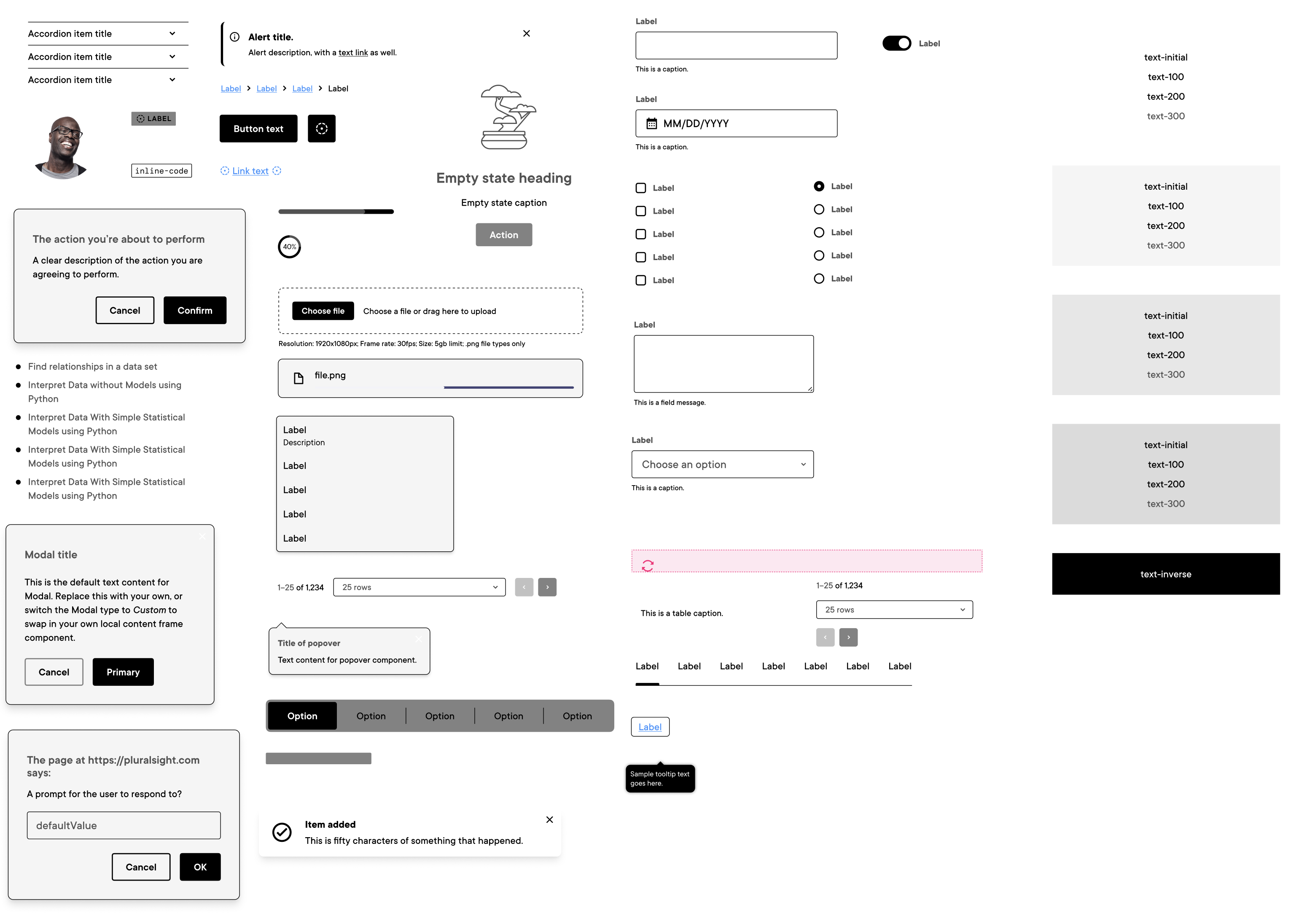
Auto layout got a similar pass across the board. Components that were still using older constraint-based layouts got migrated over, which made resizing more predictable and made the kit’s structure closer to how engineers write flexbox in CSS. That alignment matters more than it sounds. When a designer hands off a component that matches the code’s mental model, the conversation about spacing and layout gets shorter.
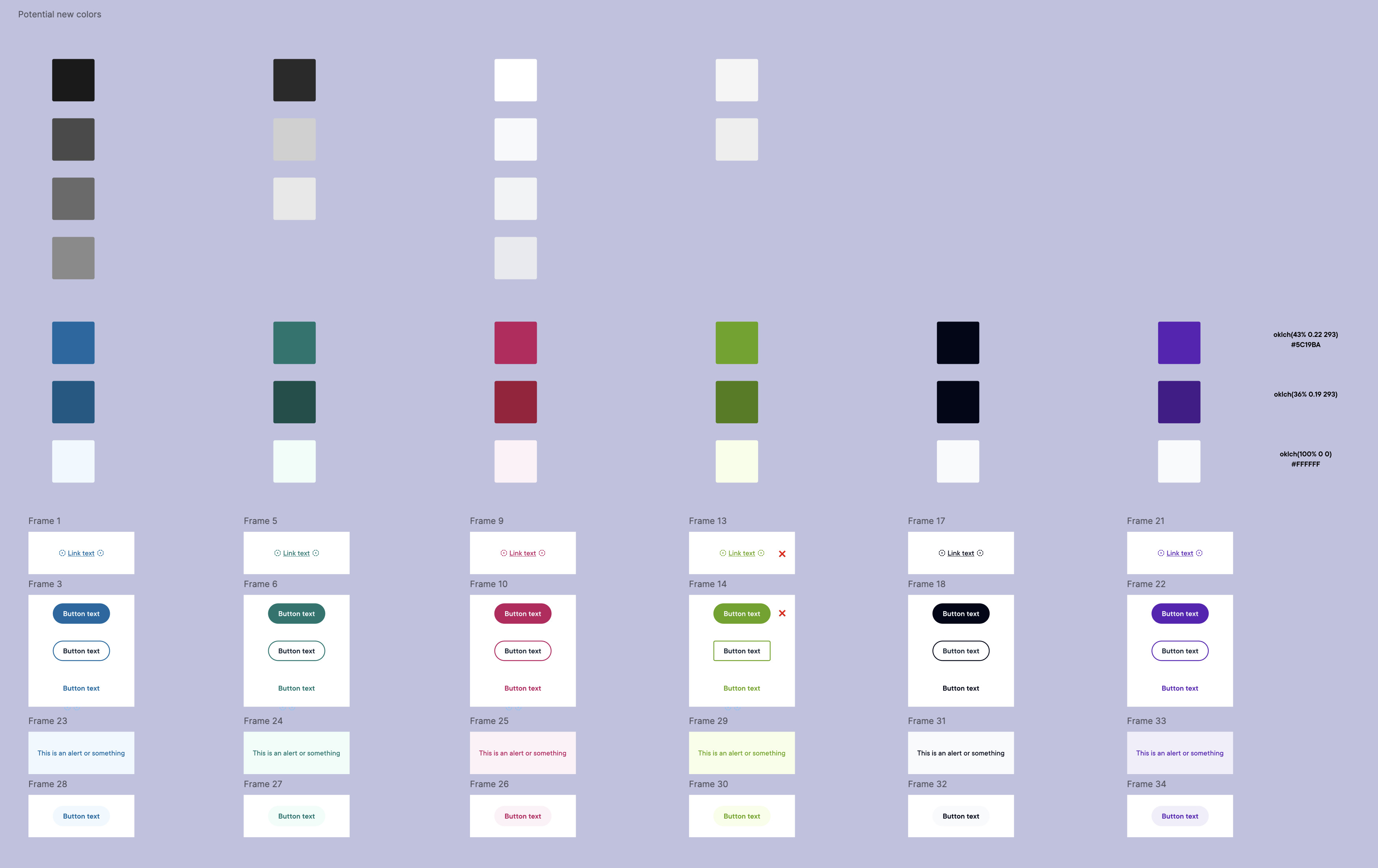
Pluralsight released a rebrand in the summer of 2025 with updated brand colors, and rolling those through Pando meant auditing every place the old primaries were in use and validating the new ones against the system’s accessibility requirements. The rebrand was also a chance to simplify some of the color decisions that had accumulated over time.
On the code connection side, I added a Figma section to each component’s guideline file covering Figma property-to-React prop mappings, Code Connect status, and Figma Make failure modes specific to each component. Eighteen of the thirty-six components are fully Code Connect mapped. That documentation now also lives in the Pando Claude skill, so it travels with every Claude session rather than only existing in Zeroheight.
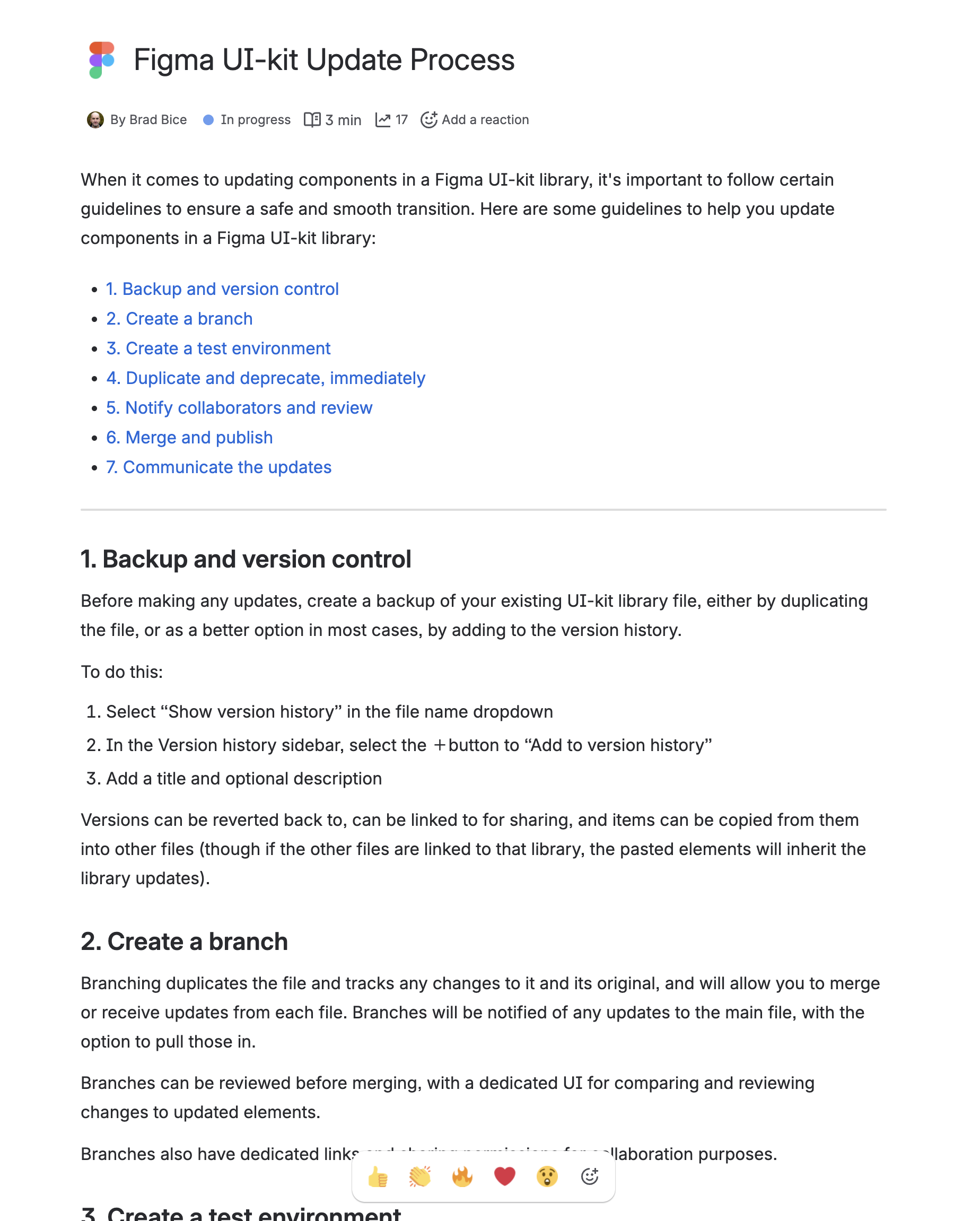
The kit is always a few steps behind something, whether it is a new Figma feature, a component addition, or a system decision that took time to work through. The goal is to keep the gap small enough that it is not an obstacle.