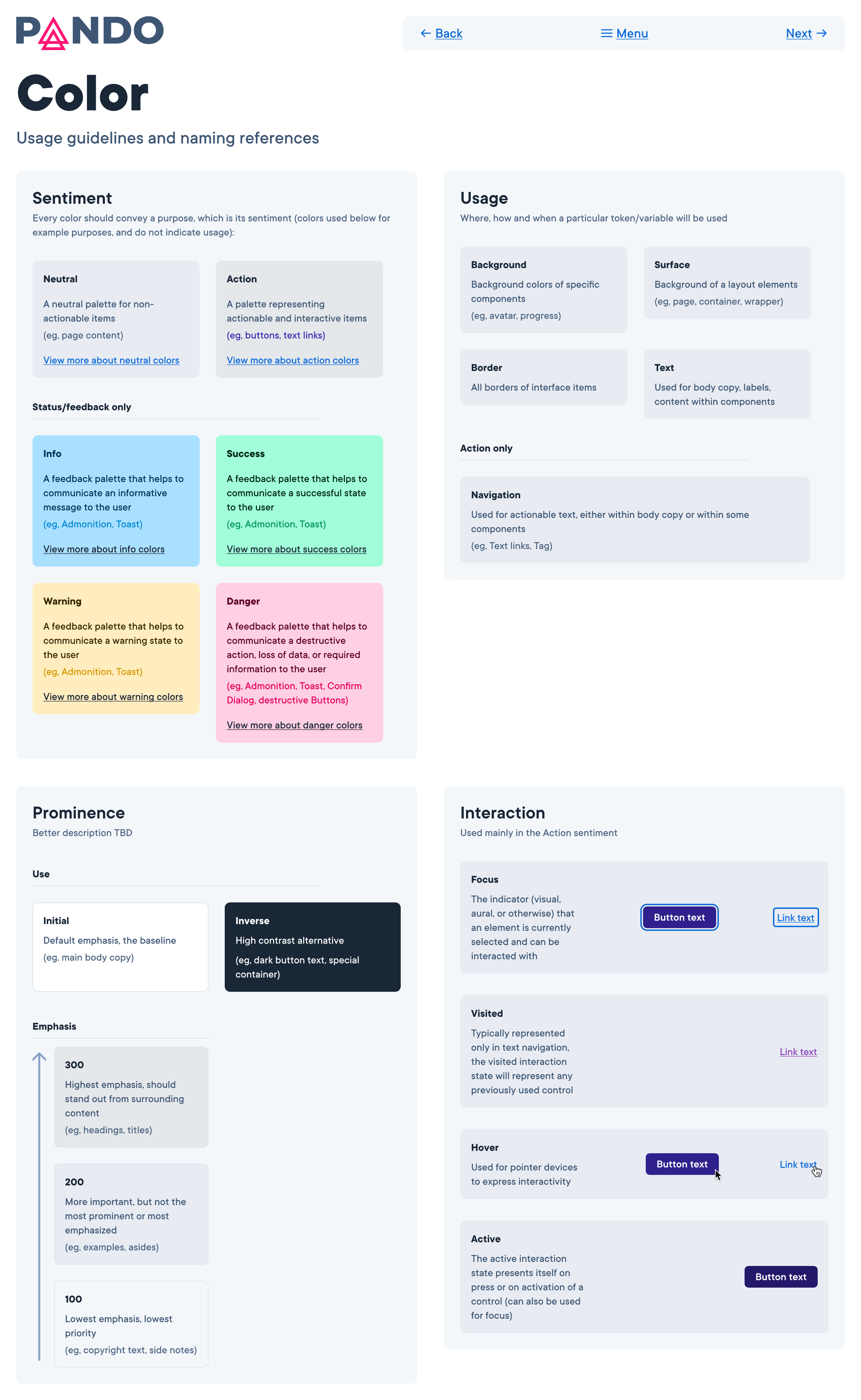
I created a set of design guidelines based on the Pando Design System component set, color values, typography, and UX best practices.
Due to ongoing technical constraints and other limitations, design documentation for our design system elements and practices could not be included in the current web implementation of our documentation. Despite this, our designers and developers needed up-to-date guides for usage, behavior, and implementation of our system.
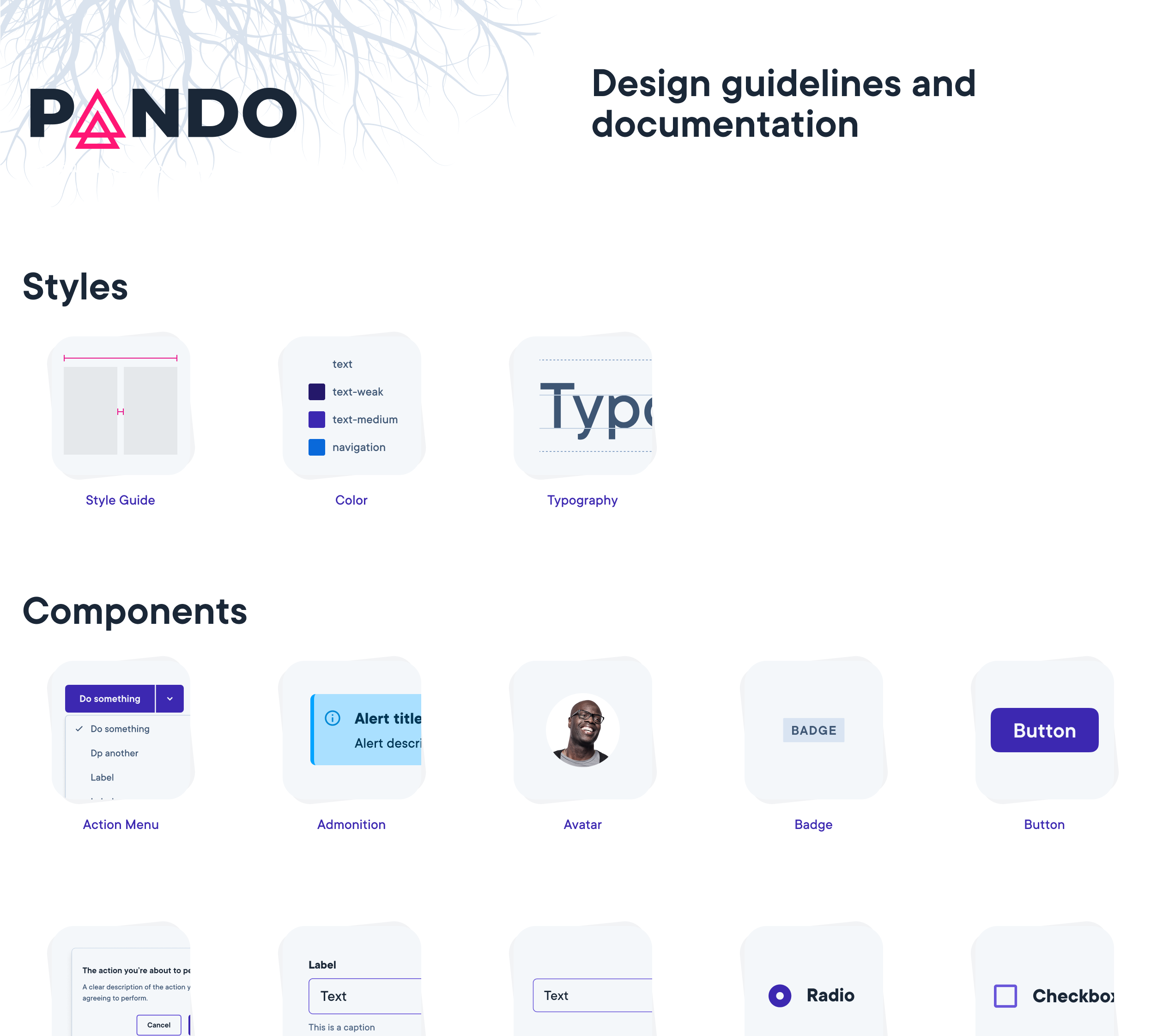
I created a fully functioning Figma prototype of a design guidelines site that served as a stopgap until we were ready to fully integrate with the documentation website. This allowed our users to access guidance either via the web (URLs to individual pages and sections were available) or within the Figma design tool they were already using.
Another benefit is that this served as a testing bed and target of feedback for users as they searched for and utilized this information. The team has planned to use this as a model for integration of design guidelines into the proper design system documentation website.