As Principal Product Designer, Design System at Pluralsight, I worked on standing up the Pando Design System - a framework-agnostic and accessibility-driven suite of design and development tools and guidelines.
Pluralsight had struggled with its initial design system offering (subsequently dubbed “Classic”) - often hearing tales of the system not being flexible enough, not offering any customization, breaking on new versions of React, or with its patterns failing accessibility tests.
Engineers and designers set out to change this with the Pando Design System. My contributions came a few months into the process, with much of the visual design established.
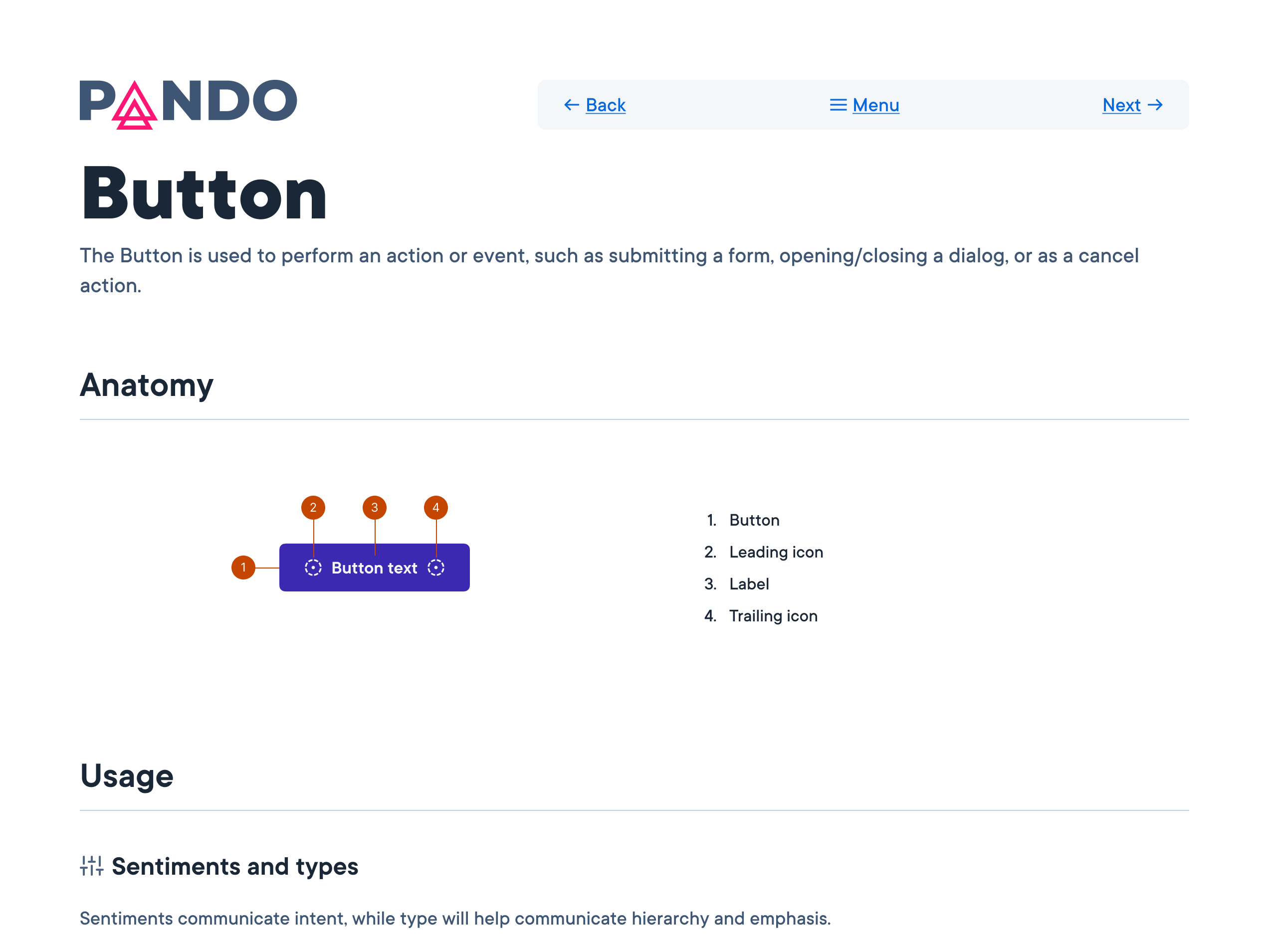
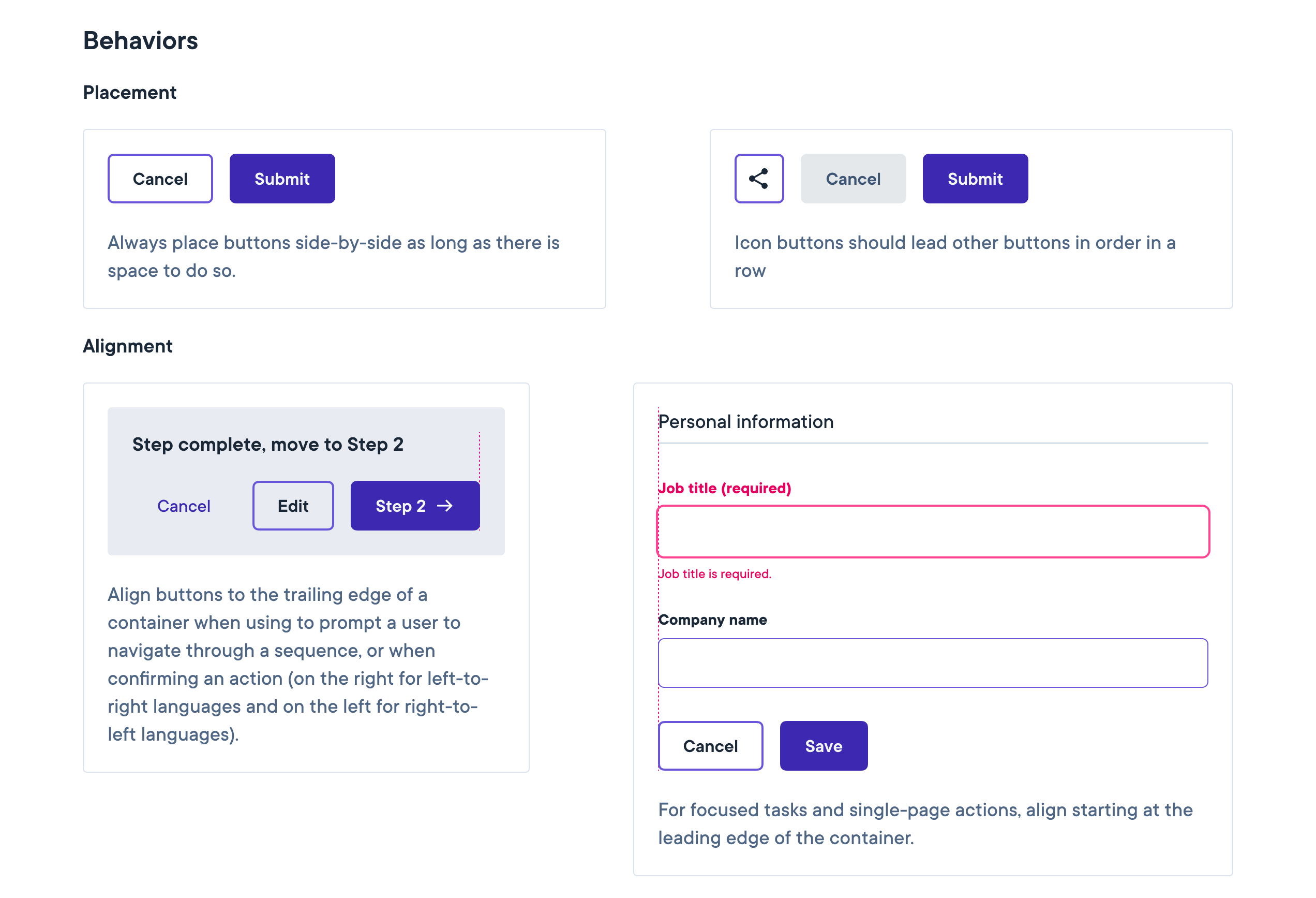
I proceeded to write documentation, craft design guidelines, update the Figma UI-kit with new features, and further align design elements to Pluralsight’s newly established brand identity. There were also many accessibility questions to be answered: text links were not passing color contrast tests, badges and buttons were not discernable in their interactivity, and many other best practices were not yet established and baked into the system.
While the company battled with economic “headwinds” and internal planning changes, the design system work was hampered by many stops and starts, with team members leaving or being replaced through the first 2 years. Once a solid direction was established, momentum picked up and we were able to strengthen our resolve and move nearer to its goals.