After Hours Blog

This is a personal and professional blog by me, Brad Bice. I've combined all of my opinions, reviews, technical learnings and other writings and ramblings into one stream of consciousness. Thanks for stopping by!

I am a CSS Designer

I’ve done a few job interviews over the summer as I’ve transitioned between roles. Each interview has similar questions, one of them being:

“What is your ideal role?”

I often begin explaining that I would like a role that offers a bit of web design and web development mixed into one. I am proficient in graphic design and I am slightly more advanced in writing HTML/CSS code. I’ve worked with designers and developers directly for my entire career, and have often bridged the gap between the two (and it is often a large gap.)

However, the word design seems to capture everyone’s attention very quickly. When it comes to the web, I’ve found that “design” or “designer” can mean something very different from the world of print, 3D space or other mediums. This is because unlike print or sculpture or other mediums, the web is a very fluid, malleable, living thing.

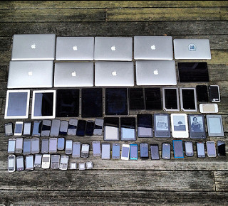
There are millions of devices that display the web very, very differently, from a laptop browser to an iPhone to a Playstation on a TV to a watch, there is no guarantee that the person viewing a website will be doing so under specific circumstances or environments. And in those very different devices are more variables like window sizes, screen orientations, interactive capabilities (pointer device or touch?) and more. And to add even more complexity is the thought process into how a person is using web content, on what device, and where they may be or what they may be doing (sitting at home on a laptop vs. in the subway on a mobile device. Different environments, different challenges like screen space, network bandwidth, ease of use, etc.)

Along with being fluid, web content can also be required to be very malleable. What I mean by this is that an image can not be displayed at 1024x768 pixels on every device. Text size of 12 points might look great on a desktop monitor, but may be way too small on a large projection screen. That neon green background color makes a paragraph look outstanding, however if the page is printed, the background color most likely will not be and the effect could be lost. Web content needs to be molded and shaped into what the user needs, whenever and wherever they are accessing it.

Finally, the web is a living breathing thing. Sure there are sites that have gone untouched since 1997, however the most commonly visited websites are those that are frequently updated with fresh content, keeping their visitors coming back for more. With changing content comes new challenges. Maybe that one line headline that we made room for now has two lines. Maybe that photo for the news story is in landscape instead of portrait orientation. Or maybe a huge sale will need to push all of the other content out of the way, for this weekend only! Web content is always changing, moving and being manipulated.

For these reasons, there needs to be CSS designers. CSS designers should work hand-in-hand with graphic designers and User Interface designers when planning and designing a website. A plan for a website can include a header with a navigation menu running across the top, but what happens when the user shrinks their browser width, or moves to a mobile phone? As designers create visual compositions for these scenarios, a CSS designer will need to plan and develop for the in-between moments. At what point will the menu shrink behind a menu button on mobile devices? Will the menu just pop behind the button or will there be a transition effect?

Along with solving implementation of design, a CSS designer must also solve other problems, such as saving on bandwidth, and progressively enhancing the web experience for all users and devices.

Many of us enjoy fast internet connections in our homes and workplaces, but can be saddled with data plan caps and/or slow network speeds on our mobile devices. That large, 3MB photo may download just fine on your laptop at work, but when you check it on the train at night delivers a not-as pleasant waiting period. CSS designers must implement ways to account for these situations by delivering appropriately sized images, or preventing download until the image is displayed (for example.)

Along with bandwidth, another unknown is technology. Many offices and homes are up-to-date on the latest browsers, computers and capabilities. However, most are way below the cutting edge. CSS designers are tasked with maintaining accessibility and usability of web content while adding on features and complimenting effects for those with technology that supports them. This is called progressive enhancement, and it ensures that even if someone is using a very outdated form of technology, the web content is still readable and usable.

Many of these decisions can be made by UI designers, web architects, graphic designers and more. However, a CSS designer/developer is the one who will implement and ship these solutions. I enjoy being a part of thinking through and solving the many road bumps of the web. I enjoy optimizing and progressively enhancing content for all users. And I enjoy writing CSS. It is a form of design that is unconventional but, I believe, is very essential.
To-Do: Find the Right To-do App

Having recently gotten married, I’ve gone through a few months of hectic planning and the attempt to organize tasks, assignments (from the wife-to-be) and various to-dos that come along with joining in holy matrimony. I tried out pretty much every to-do app available for iOS/iPhone/iPad, as well as a few web-based systems.

Update 2019-04-03 Finally updating this to remove the broken link to the Mailbox app website, since this app was sunset by Dropbox in February of 2015.

Some of the better systems that I tried included Wunderlist, TeuxDeux and Clear. I was looking for the ability to obviously create tasks with reminders, but also to be able to assign them to others and categorize them. While many of these apps were designed well and did one or two of those functions very well, none of them completely met my needs.

The solution I ended up with involves use of 2 apps: Apple’s Reminders and Mailbox.

So, after spending lots of time researching and using other to-do apps, it turns out that Apple’s default Reminders app does pretty much everything I need. You can create tasks, turn on reminders per time or per location, and share lists with someone. Lists and items also sync over iCloud, so anything I do on my phone automatically appears on my desktop computer and vice-versa.

For more complex to-do items, or tasks that come from email (as they often do,) I am trusting Mailbox. It is an email app that makes keep track of messages and mail much less stressful. They designed it with email as a to-do list in mind, since that was what many people were using email for. It allows you to check off (or archive) email that you don’t need to do anything, hide and be reminded later of mail that you can put off for a while, and helps you get to the satisfying and relaxing empty inbox. It takes a little while to get used to, but once I had used it for a few days I ended up loving it and probably won’t be able to go back.

Both of these apps are free (Reminders comes with iOS devices and Macs, Mailbox is a free app but requires a Gmail account, for now.) Try them out and see if you agree.

Thoughts On Dwyane Wade

I make it no secret that I hate the Miami Heat. And I hate Lebron James. And I hate the star-system that has taken over and ruled the NBA ever since Kevin Garnett and Ray Allen joined the Celtics in 2008.

But I can deal with it all in some fashion or another. However I can’t deal with my absolute hatred of Dwyane Wade and the miserable human being he is. This is a pretty close summarization of my thoughts on him, via Andrew Sharp on Grantland:

To review:

  • He dresses like Lucille Bluth.
  • When he’s struggled, he’s generally refused to take responsibility.
  • He remains king of the cheap shots.
  • He nicknamed himself “WOW” earlier this season, and even LeBron said it was corny.
  • He’s been a liability for the majority of the Heat’s playoff run, and before Thursday, there was plenty of evidence the Heat are better without him.
  • Even when he plays well, he still dominates the ball, complains to the refs constantly, and hijacks the Miami offense for possessions at a time.

This is an incomplete list of Dwyane Wade transgressions, but you get the idea.

And he’s not getting traded. No matter what anyone says about the Heat maybe possibly parting ways with D-Wade, no matter how badly he falls off, it’ll never happen. Because he played a crucial role in the shady process of recruiting LeBron, because he is a certified deity in South Florida, because nobody would ever trade for him at this point. In other words, we’re stuck with Wade front and center on the best team in the NBA for at least the next year or two. After Game 7 he told reporters to call him “three,” and then corrected a reporter who called him “Dwyane.” It’s horrible. He is horrible.

But he played well last night. And came up huge in a must-win Game 4. And in the two biggest games of the Pacers series. And in the closeout game against the Bulls.

I wrote about this a few weeks ago: You can hate Dwyane Wade, you can curse his name during every Heat game, and you can make jokes about how objectively horrible he’s become, but he always finds a way to show up and silence everyone. He did it again in Game 7 — 23 points, 10 rebounds, two blocks — because of course he did.

And when he was giving drunk interviews and doing confetti snow angels and giving himself nicknames last night, I was even a little happy for him. Just for a second. He deserves it, because he sold his soul to the devil and/or Pat Riley, got baptized in Moët and/or ate Rony Seikaly’s heart, and because he probably played through an ungodly amount of pain the past few months. He’s incredible whether we like it or not.

See you next year, D-Wade. Hate you. Love you. Will never escape you.

Browser Wars Episode VI: Return of the Mac

I’ve switched over almost completely to Google Chrome after being a Firefox loyalist since it was first called Firebird. I even contributed to the Firefox 1.0 project and got my name in the New York Times.

But after a while Firefox’s memory leaks and constant slowness got to me and sometime around the beginning of last year I changed over completely to Google Chrome. What sold me on it was definitely not the UI (aka the “chrome”) but rather Google Sync, which allowed me to have my bookmarks sync across any computer I was signed into (home, work and phone.) Also, Chrome uses Webkit so they were usually leading the charge in supporting new web standards.

I’ve been looking for quality alternatives to pretty much any Google product lately, so I’ve been browser shopping. Lately I tried a complete switchover to Safari, seeing as how I’m pretty much married to Apple products (our household has 2 iPhones, 2 iPads, a Mac Mini, a Macbook Air, and an Apple TV… all marvelously synced in the Apple-ecosphere. Oh, and yes we have home owners insurance.) However, Safari turned out to be very slow, a pretty significant UI changeover from Chrome, and had a few other minor annoyances that I just could not get past.

I went crawling back to Chrome for a couple of weeks, but I’m trying Safari again. I’m not entirely sure why but maybe the minimalistic nature of it appeals to me. Some of the small unique quirks of Safari are growing on me, but there a few things I would like to see either changed or made optional:

  • Resizable tabs - If I have 4 tabs open, don’t stretch them to fill the full width of the window. Or at least make this a setting.
  • Right-click, Open in New Tab - Allow me to put this option above Open in New Window in the right-click menu
  • Sync settings - iCloud syncs bookmarks and tabs, well how about browser settings? I don’t want to have to remember settings for each of my computers
  • Allow me to move the refresh button - I’m not sure why they would bury it in the address bar ala Internet Explorer.

Game over

My time in the sports licensed retail business is done. I have moved on to a new opportunity after 3 1/2 years at Dreams Retail / Fanatics, Inc.

It was great to be able to apply my web skills to the sports world, and to work with brands such as the Philadelphia Eagles and the Chicago Bulls. I’ll always appreciate the experience I gained and the relationships that formed while there.

But life moves on and I am now a member of a great development team at Medtelligent, Inc. They create web-based software for assisted living communities and I’m very excited to work with a great group of people on a wonderful product.

Life works in strange ways, and I’ve been very fortunate to be able to pursue my professional dream with wonderful opportunities!

Pro Wrestling

It’s been 25 years since I first saw professional wrestling on TV.

Pro Wrestling game for NES, which is not what this article is about

I’m not sure why I remember that it was in March of 1988 that I turned the channel and became mesmerized by Superstar Billy Graham flexing and two pathetic no-name wrestlers trying to pull his arms down, only to be thrown to the mat. I was 8 years old at the time, Saturday morning cartoons had just ended and I was probably bored and looking for something else cartoon-ish to entertain me.

Fast-forward 25 years and I’m still entertained by pro wrestling. Definitely not to the extent that I have been in periods of my life, but I’ll still watch a show or linger on the channel or visit wrestling websites for the latest news and gossip. But I can’t quite put my finger on why I like it, and I as I grow older it gets harder to justify to myself.

When I was young, it was easy to understand why I loved it. Here were these costumed superheroes, fighting costumed bad guys, and looking and sounding so cool while they did it. They wrestled/performed in huge arenas with rocking 80s music and a spectacle that no one but Vince McMahon has ever been able to display. Monsters ranged from the incredible Andre the Giant to the dastardly “Million Dollar Man” Ted Dibiase. They wore cool shiny gold belts and walked around with gorgeous women. I wanted to be them, I wanted to wrestle, and I wanted to dress like a superhero. They were building toward WrestleMania 4, and I recreated this with my toy wrestling ring and figures.

5 years in, around 1993 and now 13 years old, I was approaching high school and was knee-deep in adolescence. My attentions diverted to music and girls, and whatever else kept me busy as a teenager. So I stopped watching wrestling, but never really stopped following it. I knew who was good and who was bad still. I knew who was WWF and who was WCW. I still leafed through black-and-white wrestling magazines at the grocery store.

In 1996 a couple of guys (Scott Hall and Kevin Nash) jumped ship from the WWF to WCW in a way that made it look like they hadn’t actually left the WWF, but were appearing on WCW TV anyways. This BLEW MY MIND. Before the days of internet news sites and twitter and the information era, the audience didn’t know all the backstage goings-on with wrestling. We didn’t know wrestlers’ contract status or info about who signed with what company. So when Hall & Nash appeared on WCW Nitro, my brain snapped and I was back in. More than ever, I was a pro wrestling fan. I went to a Nitro live show. I went to a WWF Raw show. I bought the magazines, taped the TV shows, and bought a couple of wrestling t-shirts. For another 4-5 years, they had me.

After that, it was just casual entertainment. I didn’t fret if I missed a show here or there. Besides, I now had the internet to help me catch up on storylines and happenings. Because of the internet, spoilers kept too much big from surprising anyone, taking some of the magic away from the whole thing.

This weekend is WrestleMania 29, highlighted by current stars like CM Punk, John Cena and Brock Lesnar. The audience has matured from the good guys vs. bad guys schtick, they all know matches are predetermined and that the guys (usually) don’t actually hit each other.

But the thing that most people never understood is that whether any of it is real or not wasn’t the point. The point was how real they made it feel to us, what emotions they could bring out, and how fun they made their shows. It was fun watching the matches, it was fun booing people we didn’t like, and it was fun watching the spectacle of the whole thing. They coined their own term of “sports entertainment” because they get it.

It’s still fun for me to keep up with, and until it really gets watered down, I’ll probably still know who will be in the main event each year at WrestleMania.

Why the Closing of Google Reader Matters

On Wednesday, March 13th, Google announced that they will be closing their popular (in opinion if not in numbers) Google Reader product on July 1, 2013.

As a Reader user, I was kind of shocked to see that a product that seemed to be steadily improving, and that also seemed to not be too resource-dependent on Google’s part, be relegated to the trash bin.

For those that don’t know, Google Reader is a tool for aggregating and viewing RSS feed content. RSS feeds are streams of updates from websites and services. This blog has an RSS feed that contains each of the posts that I have made, along with time and date and other meta information for indexing and organization. Reader was a tool that collected and organized feeds for easy reading, allowing users to access one page to browse all of their favorite website updates (as opposed to opening a bunch of bookmarks into multiple tabs or remembering site addresses.)

Upon release of the announcement of the closing, the web went completely ape-shit and popular news items of the day like NFL free agency and oh, just the appointment of a new Pope were pushed aside for complete panic over what people are going to do now that Reader is closing. It may seem a little trivial considering this is just a free tool for reading RSS feeds (there are lots and lots of alternative tools available,) but this is actually a fairly important red flag for everyone that uses the web.

Most of us use free services like GMail, Yahoo Mail, Twitter, Facebook, etc. for sharing and storing our information on the web. They’re great: they’re free, easily accessible, constantly updated and enhanced and they’re relevant to the types of information we want and need and how we want and need it. Services like GMail make something like email easy for the masses. Setting up your own email server or even using POP with your own domain (what’s that, right?) are fairly complicated, especially for the less-techy users out there.

The problem comes with the complete integration of our lives with these services. Sure, Google can shutter Reader and we’ll grumble but move on to another service. But what if they decide to close GMail? Our email includes details about not only our online lives, but also our offline lives as well. Bank account logins, loan details, school and work documents, and other vital details for accessing important information all lives in our email. Not to mention all of the personal correspondence and records of conversations that are also archived there. Even businesses and universities have converted from private to GMail-run email services. We have all put our vital, private information in the hands of a corporation that has the justifiable power to erase it all at the flip of a switch.

Now, it’s highly unlikely that Google will close GMail, one of its most successful (if not most popular or industry leading) products. But it’s not impossible. It’s also not impossible for services such as Yahoo, Twitter or Facebook to close either. Or to be bought out or merged with another company and fundamentally changed for better or worse. Internet giants like Flickr and Instagram have both been eaten up by larger corporations (Yahoo and Facebook, respectively,) and while their core functionality has yet to change, decisions regarding these services must eventually bend to the will of the stockholder.

I’m not giving up my GMail account anytime soon, but I will be keeping my eye on what is a growing trend of commercialized information. And I’ll try to own and/or pay for as much of my information and services as I can.

The Mythical "Fold"

Photo of devices

The “fold” on the web is a controversial topic. I personally believe that the web is different from print (where the term and concept originated) in that it is interactive.

Scroll bars and touch controls allow users to manipulate their viewing experience more and more with each new device and browser. Also,  “mobile” internet use will surpass desktop use by 2014 (Update: it actually didn’t happen until November 2016,) meaning that any concrete identification of the fold will be out the window.

Obviously there are cases where putting content near the top of a page can be beneficial, since most if not all browsers render pages with the starting point scrolled to the top (is top a relevant term when describing page location anymore? Especially since devices can be rotated and turned more than older monitors ever could.)  But I believe that is different from expressing that something be entirely or mostly “above the fold.” There should always be a content hierarchy  and browsing trends will usually point to people scrolling from top to bottom to support this.

Responsive design especially defeats the concept of the fold since it makes the “fold line” a floating and ever-changing border. Instead of concentrating on what should be above or below a line that may or may not even exist in a majority of cases, I believe authors should instead focus on a consistent hierarchy of content and embrace the ambiguity of the web.

Responsively Redesigning

I’m currently redesigning this site to take advantage of Responsive Web Design, something anyone with a website should be doing.

I’m using a “Mobile First” approach (do you see a trend here?) by serving up a minimal content set for those on cellular networks or slow connections. As the screen size increases, the design will change to allow for a different experience (a slightly different layout, larger images, etc.) The design is also resolution independent, thanks to icon fonts (the exception being photos and images, I have yet to provide new versions of those, as my focus has been on the mobile side for now.)

This is a work in progress but I wanted to express my desire and determination to create a responsive version of my website. It’s part of a “design in the browser” method that I’m using for this particular project where I am the client. So if things happen to look a little muddy at times, that’s why!

Note: Current development and testing has taken place in Google Chrome and Safari on iOS 5. These are the most-utilized browsers according to my analytics so I design in those first. Firefox and IE support is coming next. I am only using this “live-redesign” process on my personal page, and would not use or recommend it for a commercial site. See Zeldman and Zeldman.

Internet Explorer 6 compatibility

Internet Explorer 6 is the bane of web developers everywhere, much like Netscape 4 was in the early 2000s. How do we support IE6 users without going crazy?

There is a growing campaign in the web development community calling for the death of version 6 of the Internet Explorer browser by Microsoft. Introduced in 2001, it had ruled the market share of browser usage for years until the coming of Mozilla’s Firefox and Microsoft’s own Internet Explorer 7.

I did a quick Google search for the term “ie6” and found a startling six “death to ie6” websites on just the first two pages of results. These include:

And one likely parody, SaveIE6.
Update 2023-03-05 All but one of those no longer exists, appropriately, since IE6 is no longer a large issue.

One of the main reasons for the IE6 hate is its lack of support for web standards such as full CSS 2.1 compliance and PNG alpha transparency. Another is its many security issues which come with being the top browser for approximately 5 years. While no browser available supports every standard, even IE7 at least supports a larger contingent of CSS 2.1 selectors, PNG alpha transparency and is a little better on security.

While it may seem easier to point visitors to new browsers like Mozilla’s Firefox, Opera, Google’s Chrome, Apple’s Safari or even Microsoft’s Internet Explorer 8, it is important to note that some people either can not or will not upgrade. Many business computers still run IE6, and will do so for years to come. So what is the solution for web developers who want to escape having to “fix” their websites for IE6?

Andy Clarke, a member of the Web Standards Project and a former invited expert to the W3C’s CSS Working Group, provided a solution that I find appealing. Since the content of a website is most important, make sure that content is viewable and accessible to users of IE6 by providing them with an IE6-only CSS stylesheet. This renders the page in a very readable and organized yet generic design while separating the main design for others using more current and advanced browsers.

This is done by inserting IE conditional comments into the <head> portion of your website’s HTML, like so:

<!--[if IE 6]><link rel="stylesheet" type="text/css" href="ie6.0.3.css" media="screen, projection" /><![endif]-->

The stylesheet code is available on Google Code for anyone to use for free. I am using it on this website as a mere 10% of my visitors are currently browsing with IE6. It is important that designers and developers view their logs and stats to determine what browsers to support. I will usually adapt my design for IE6 (or any other browser) if more than 30% of my visitors are using it.

As Jeffrey Zeldman said when referring to Clarke’s method, “no solution, however elegant, will work for every situation.” But work like this will allow for an easier transition as the world upgrades.