After Hours Blog

This is a personal and professional blog by me, Brad Bice. I've combined all of my opinions, reviews, technical learnings and other writings and ramblings into one stream of consciousness. Thanks for stopping by!

The Mythical "Fold"

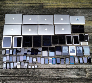
Photo of devices

The “fold” on the web is a controversial topic. I personally believe that the web is different from print (where the term and concept originated) in that it is interactive.

Scroll bars and touch controls allow users to manipulate their viewing experience more and more with each new device and browser. Also,  “mobile” internet use will surpass desktop use by 2014 (Update: it actually didn’t happen until November 2016,) meaning that any concrete identification of the fold will be out the window.

Obviously there are cases where putting content near the top of a page can be beneficial, since most if not all browsers render pages with the starting point scrolled to the top (is top a relevant term when describing page location anymore? Especially since devices can be rotated and turned more than older monitors ever could.)  But I believe that is different from expressing that something be entirely or mostly “above the fold.” There should always be a content hierarchy  and browsing trends will usually point to people scrolling from top to bottom to support this.

Responsive design especially defeats the concept of the fold since it makes the “fold line” a floating and ever-changing border. Instead of concentrating on what should be above or below a line that may or may not even exist in a majority of cases, I believe authors should instead focus on a consistent hierarchy of content and embrace the ambiguity of the web.

Responsively Redesigning

I’m currently redesigning this site to take advantage of Responsive Web Design, something anyone with a website should be doing.

I’m using a “Mobile First” approach (do you see a trend here?) by serving up a minimal content set for those on cellular networks or slow connections. As the screen size increases, the design will change to allow for a different experience (a slightly different layout, larger images, etc.) The design is also resolution independent, thanks to icon fonts (the exception being photos and images, I have yet to provide new versions of those, as my focus has been on the mobile side for now.)

This is a work in progress but I wanted to express my desire and determination to create a responsive version of my website. It’s part of a “design in the browser” method that I’m using for this particular project where I am the client. So if things happen to look a little muddy at times, that’s why!

Note: Current development and testing has taken place in Google Chrome and Safari on iOS 5. These are the most-utilized browsers according to my analytics so I design in those first. Firefox and IE support is coming next. I am only using this “live-redesign” process on my personal page, and would not use or recommend it for a commercial site. See Zeldman and Zeldman.

Internet Explorer 6 compatibility

Internet Explorer 6 is the bane of web developers everywhere, much like Netscape 4 was in the early 2000s. How do we support IE6 users without going crazy?

There is a growing campaign in the web development community calling for the death of version 6 of the Internet Explorer browser by Microsoft. Introduced in 2001, it had ruled the market share of browser usage for years until the coming of Mozilla’s Firefox and Microsoft’s own Internet Explorer 7.

I did a quick Google search for the term “ie6” and found a startling six “death to ie6” websites on just the first two pages of results. These include:

And one likely parody, SaveIE6.
Update 2023-03-05 All but one of those no longer exists, appropriately, since IE6 is no longer a large issue.

One of the main reasons for the IE6 hate is its lack of support for web standards such as full CSS 2.1 compliance and PNG alpha transparency. Another is its many security issues which come with being the top browser for approximately 5 years. While no browser available supports every standard, even IE7 at least supports a larger contingent of CSS 2.1 selectors, PNG alpha transparency and is a little better on security.

While it may seem easier to point visitors to new browsers like Mozilla’s Firefox, Opera, Google’s Chrome, Apple’s Safari or even Microsoft’s Internet Explorer 8, it is important to note that some people either can not or will not upgrade. Many business computers still run IE6, and will do so for years to come. So what is the solution for web developers who want to escape having to “fix” their websites for IE6?

Andy Clarke, a member of the Web Standards Project and a former invited expert to the W3C’s CSS Working Group, provided a solution that I find appealing. Since the content of a website is most important, make sure that content is viewable and accessible to users of IE6 by providing them with an IE6-only CSS stylesheet. This renders the page in a very readable and organized yet generic design while separating the main design for others using more current and advanced browsers.

This is done by inserting IE conditional comments into the <head> portion of your website’s HTML, like so:

<!--[if IE 6]><link rel="stylesheet" type="text/css" href="ie6.0.3.css" media="screen, projection" /><![endif]-->

The stylesheet code is available on Google Code for anyone to use for free. I am using it on this website as a mere 10% of my visitors are currently browsing with IE6. It is important that designers and developers view their logs and stats to determine what browsers to support. I will usually adapt my design for IE6 (or any other browser) if more than 30% of my visitors are using it.

As Jeffrey Zeldman said when referring to Clarke’s method, “no solution, however elegant, will work for every situation.” But work like this will allow for an easier transition as the world upgrades.